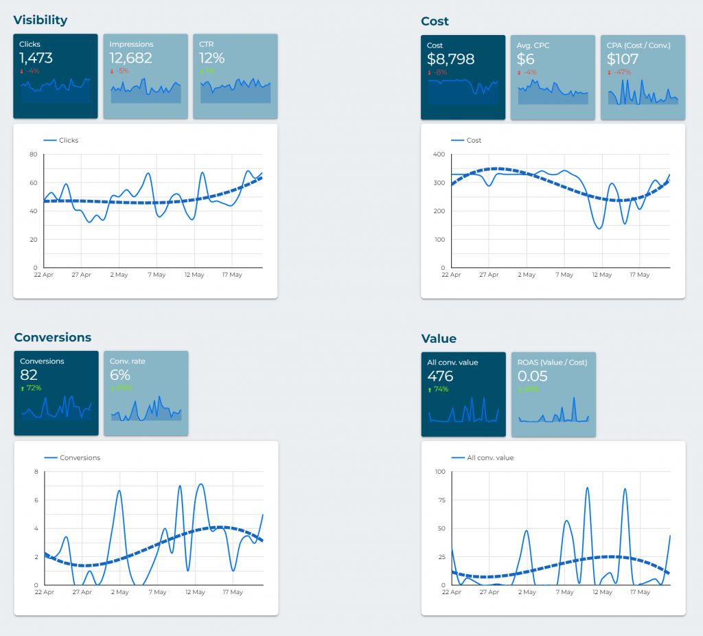
It’s a dashboard designed for frequent reviews of the account. It allows you to stay updated on the results in a simpler and faster way than going through many different Google Ads reports (you would have to consult and customize about 10 reports to see all this data). We recommend checking this dashboard once a week.
At the top (dark blue background), various filters are displayed (campaign, group, country, and device). It’s not essential to use them, but they can help you quickly view many data and graphs for one or several elements. The filter you indicate will be applied to all the tables and graphs in this dashboard.
You can also change the date there (by default it shows the last 28 days, but you may be interested in analyzing a longer or shorter time period).

The introduction presents the key metrics for the entire account (total figures). Key metrics are marked in dark blue and less important ones in light blue.

Then, several tables are shown that divide the results into different key aspects (campaigns, groups, keywords, search terms, etc.).
Colors are used to quickly visualize the most important data. Green is good, red is bad. If it’s darker green, it means it’s the best value in that table. Conversely, darker red means worse data.
The variation (“% Δ”) of each data in the dates you have selected, compared to the immediately preceding period, is also shown. For example, if you select May 2024, it will be compared with the data from April 2024 (green arrow upwards if that data has increased in May, red arrow if it has decreased). The colors of the arrows only indicate increase or decrease, not whether that variation is “good” or “bad.”
The tables are sorted by the criterion that is generally most interesting (e.g., “impressions”), but if you want to see the results sorted differently, you can change it by clicking on the title of the corresponding column.
In the “Landing pages” table, you may encounter a blank line (with metrics but no URL). This is probably because you use DSA (Dynamic Search Ads) in one or more campaigns. In DSA, a fixed URL is not set (the promoted URLs/pages vary dynamically), so they appear as a “blank” URL in this URL report.
In the “Countries” table, you may find countries where you thought you weren’t advertising. This is generally because you have activated showing some campaign (or all) to users interested in that country (even if they are not physically there at that moment), which is the default option. You can deactivate that option or exclude specific countries from your campaigns (especially recommended if there are many clicks and no conversions from those countries).
In the “Months” table, you have to consider the date filter you have indicated (in the selector at the top right of the dashboard). For example, if you have selected the dates from April 15th to May 15th, this table will not show the complete data for April and May, but only the data corresponding to those selected days of each month. This report is mainly intended to assist in long-term analysis (many months) and filtering by complete months (starting on the 1st and ending on the 30th or 31st).
In the last table (“Conversions”), the types of conversions that have been recorded (number and value) are shown. There may be results with decimals. This happens because a attribution system is being used in Google Ads that “distributes” the recorded conversions among all the sources that have been involved (for example, if a user who makes 1 conversion first comes from Google Ads but doesn’t convert in that visit and then visits from Facebook to end up converting, that conversion will be divided between both sources).