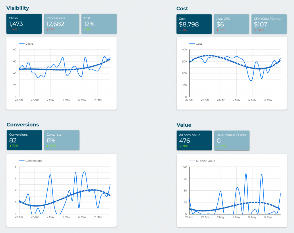
This is a simplified version of the “Complete” dashboard. It’s intended for people who want to see how campaigns are going but don’t need many details (for example: executives, advisors, etc.). It can also be useful for quick reviews by account managers, although for thorough review and optimization, we recommend using the full dashboard.
You can change the dates that you want to analize using the date selector on the top right:

The introduction presents the key metrics for the entire account (total figures). Key metrics are marked in dark blue and less important ones in light blue.

Then, 4 tables are displayed that divide the results into 4 key aspects (campaigns, keywords, landing pages, and conversions).
Colors are used to quickly visualize the most important data. Green is good, and red is bad. If it’s darker green, it’s the best value in that table. Conversely, darker red means worse data/results.
In the last table (“Conversions”), the types of conversions that have been recorded are shown (number and value). There may be results with decimals. This happens because an attribution system is being used in Google Ads that “distributes” the recorded conversions among all the sources that have been involved (for example, if a user who makes 1 conversion first comes from Google Ads but doesn’t convert in that visit and then visits from Facebook to end up converting, that conversion will be divided between both sources).