We’ve compiled 9 great examples from charities and nonprofit organizations that have created good websites and online donation forms to improve their online fundraising results:
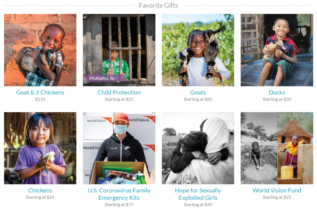
World vision
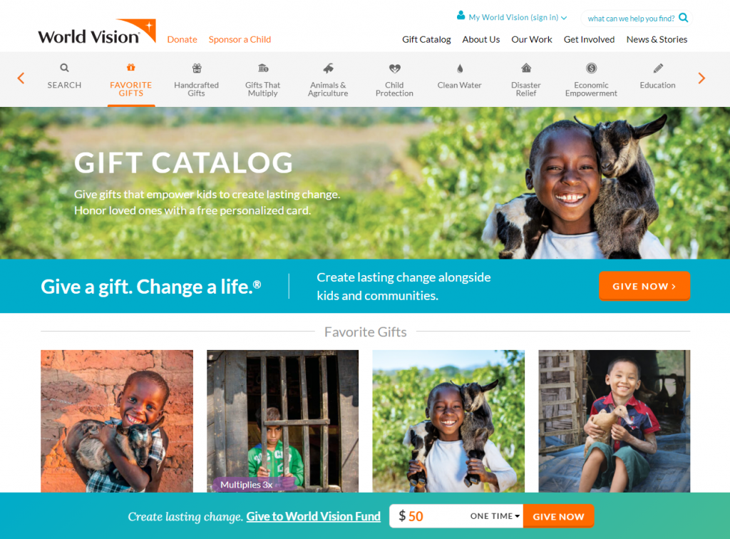
1. They present the donations as gifts of specific products to the beneficiaries (goats, chickens, ducks, emergency kits…) and other less tangible gifts (protection for children, hope for sexually exploited girls…).
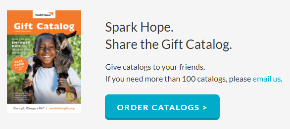
2. They invite people to order gift catalogs and also give copies to their friends. It can be much more effective than simply asking them to invite their friends to make a donation.
Obama Foundation
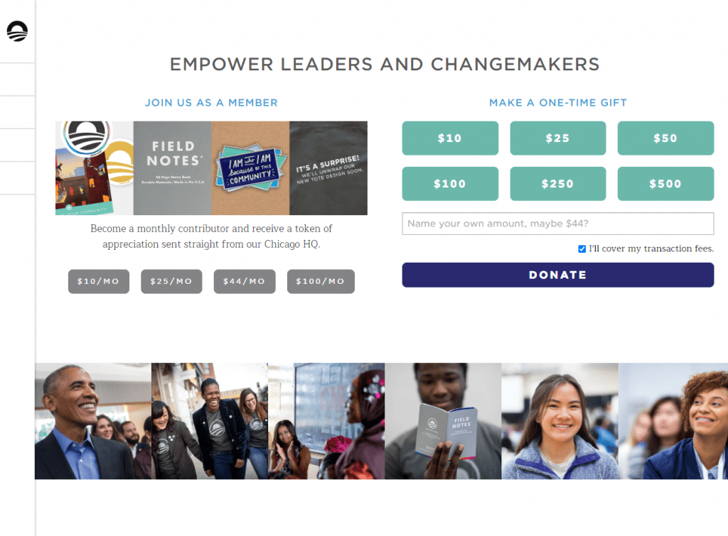
1. They emphasize the recurring donation option more than the one-off donation. In fact, it’s not presented as a donation, but rather as “Join us as a member.” They also give gifts as a thank you for recurring donations.
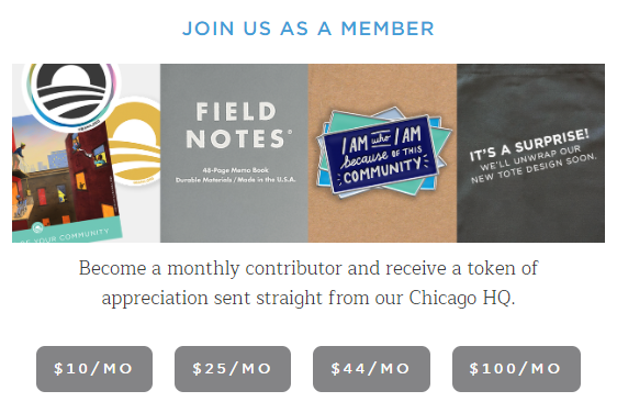
2. They use the same system as online stores (before the donation form itself, you see a “shopping” cart with details of what you are donating and the gifts you will receive).
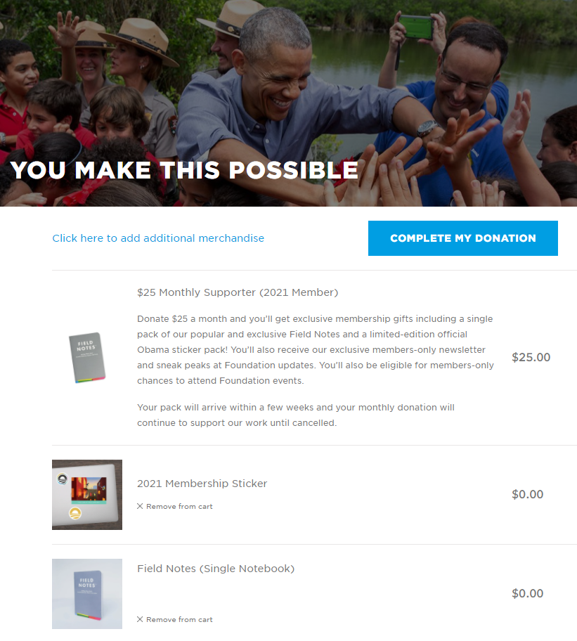
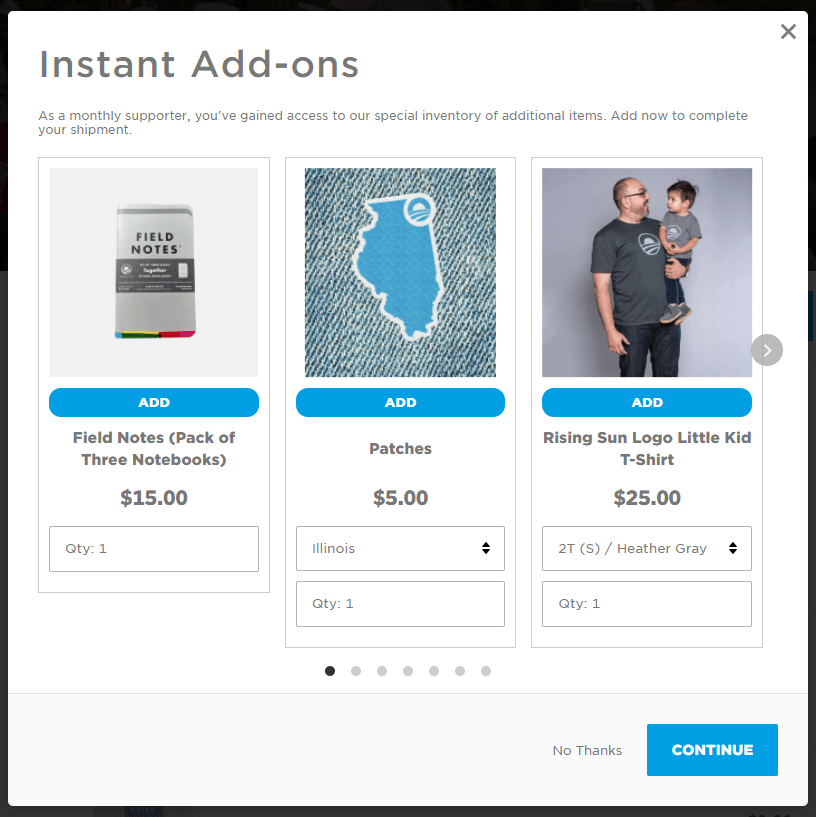
3. Before sending you to the final page of the donation process, they invite you to buy other merchandising products with the organization’s logo. This tactic is known as “cross-selling” and is used successfully in many online stores (they promote related products before completing the order to increase the total value of the purchase), but very few nonprofits use this tactic.
Alliance for Youth Action
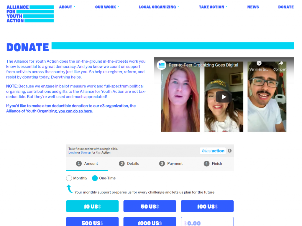
1. The design of the donation page fits in very well with the rest of the website (same colors, style, fonts…), which makes the donation experience more fluid and natural.
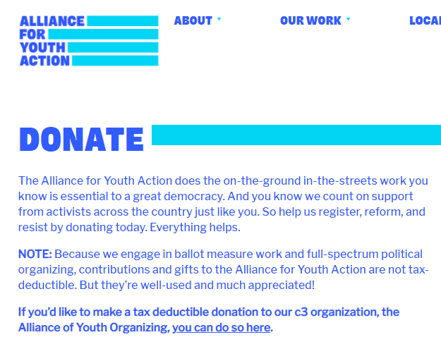
2. They highlight the recurring donation with a good phrase: “Your monthly support prepares us for every challenge and lets us plan for the future.”

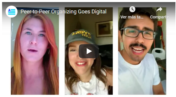
3. They show a video before the donation form, which allows the potential donor to understand better the work of the organization.
Unicef
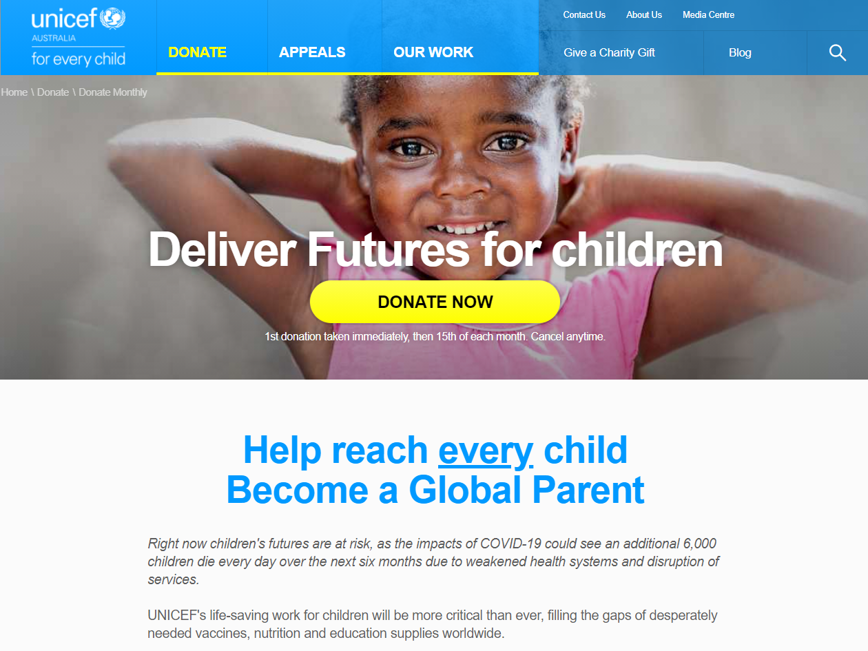
1. They start with a powerful photo and an eye-catching donate button, but they also show a lot of information after that (it’s not a page with only the donation form, as many nonprofits do)
2. They invite you to become a “Global Parent” instead of the traditional figure used by many nonprofits of sponsoring a specific child. They also show which initiatives your donation will help.
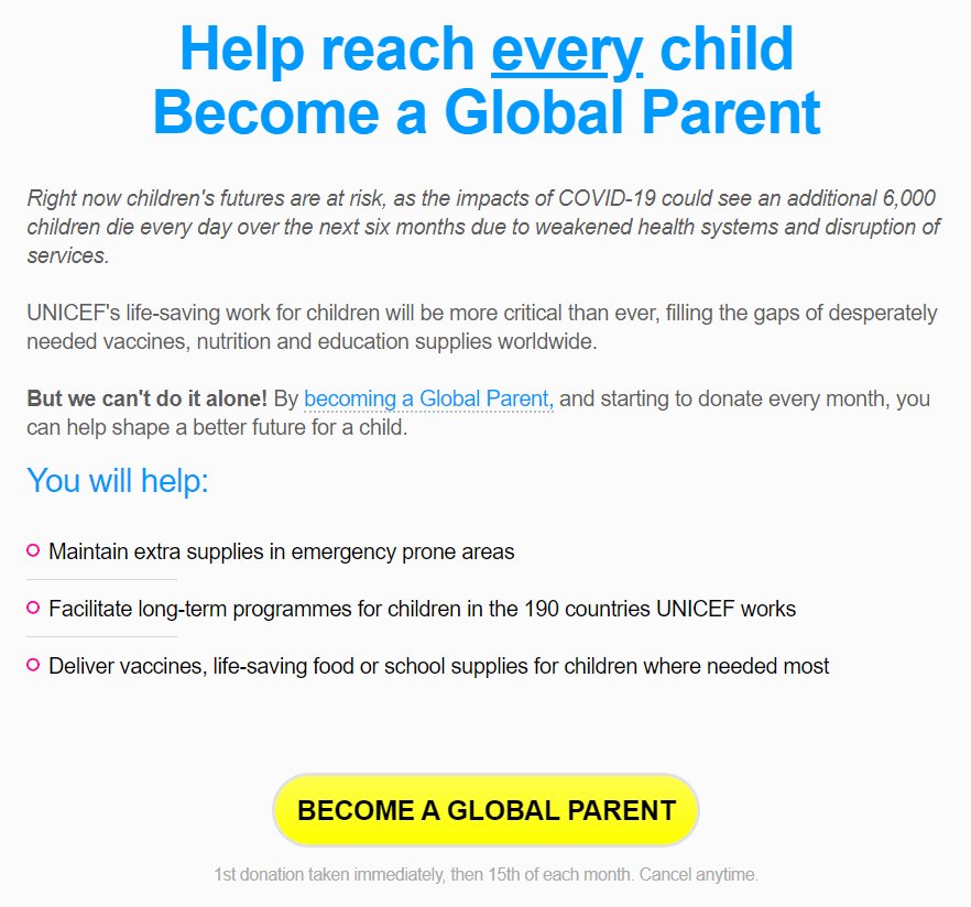
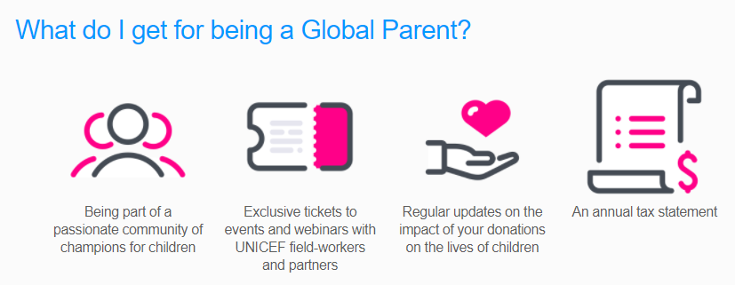
3. They tell you what exactly you are going to get for your recurring donation (being part of the community, exclusive tickets to events and webinars, regular updates and an annual tax statement).
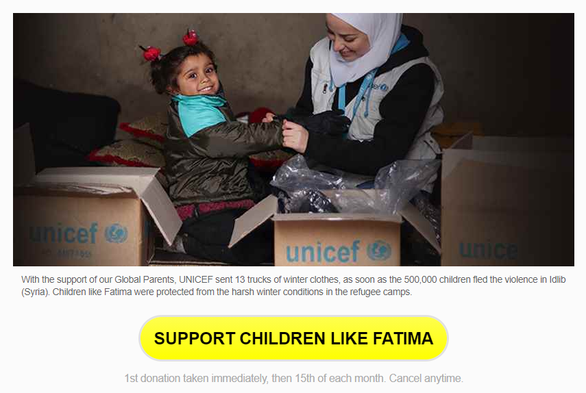
4. They show a real example of what they achieve thanks to donations. It includes figures from the project in general, as well as a photo and name of one of the girls who benefited from their programs.
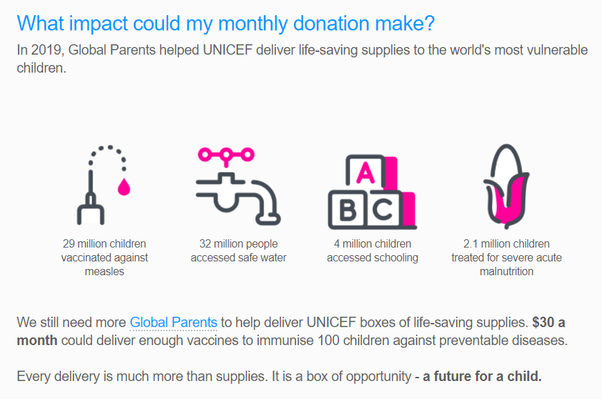
5. They show global statistics of what they achieved last year, with icons to make it more visually appealing.
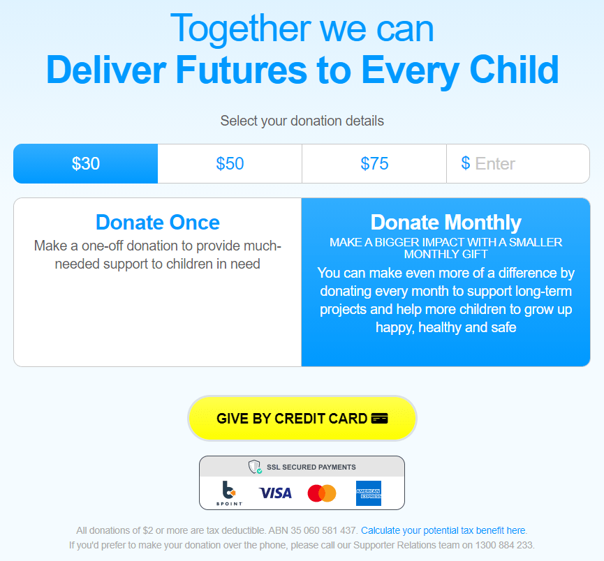
6. The first step of the donation form is fairly straightforward and highlights a lot that donating monthly is best for the cause. They also display symbols to highlight that it is safe to donate online, tax information (including a link to calculate tax deductions), and the phone number to donate over the phone .
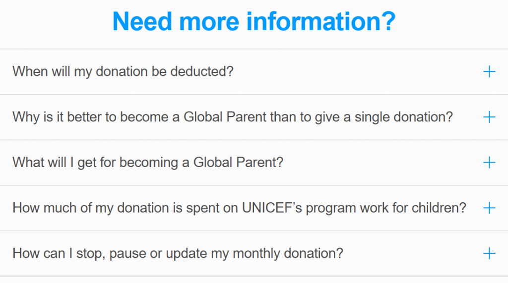
7. They show at the end a section of frequently asked questions, which can help them get more donations and at the same time reduce the costs/time involved in manually answering frequently repeated questions.
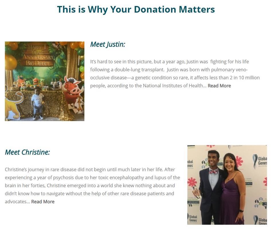
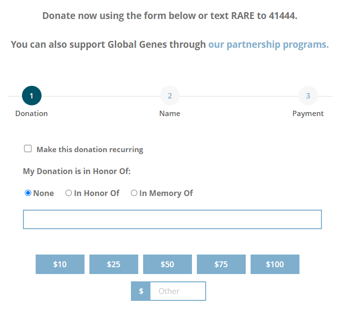
Global Genes
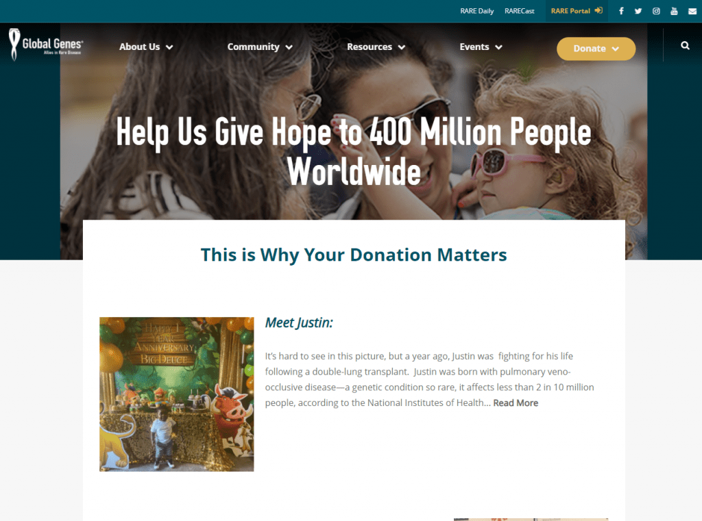
1. Before showing the donation form, they show several real cases of people who have benefited from the organization’s initiatives, including names, information, photos and even a video of these cases. In this way, they “put a face” on the problem they are trying to solve and the potential donor sees in a more tangible way the impact their donation will have.
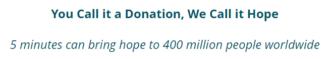
2. They emphasize that for the potential donor it may be only a small donation and 5 minutes of their time, but that translates into hope for millions of people.
3. The donation form is not particularly polished, but it is noteworthy that they emphasize that you can also donate by SMS and through partnership programs.
It is interesting to offer other options, especially if you see that the online donation form has a low conversion rate (many users arrive at the donation page, but few end up donating).
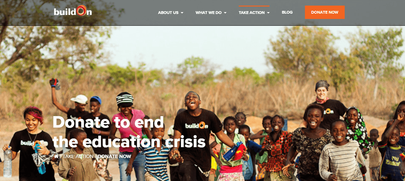
BuildON
1. They show a photo and a powerful title (“Donate to end the education crisis”), although the title is not very readable due to the contrast of the image.
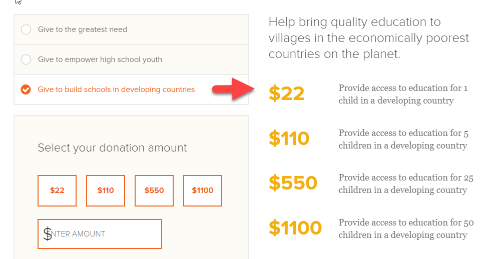
2. They allow you to select what cause you want to donate to and the explanatory text on the side changes accordingly. In this way, the potential donor feels empowered to contribute what interests him the most and has specific data on what is going to be achieved according to his donation and the cause chosen.
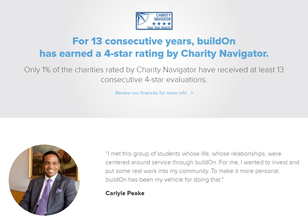
3. Several sections to increase the donor’s trust in the organization, such as their Charity Navigator score and a testimonial from a donor.
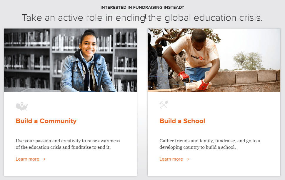
4. At the end of the page, they show other options to collaborate, especially the option of organizing a fundraising campaign:
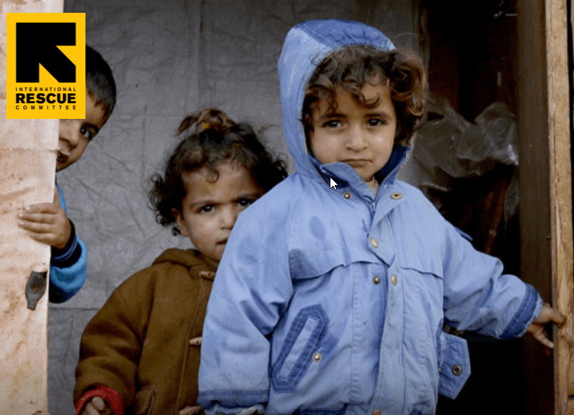
International Rescue Committee
1. A very large photo that generates emotional connection through the eyes of the children.
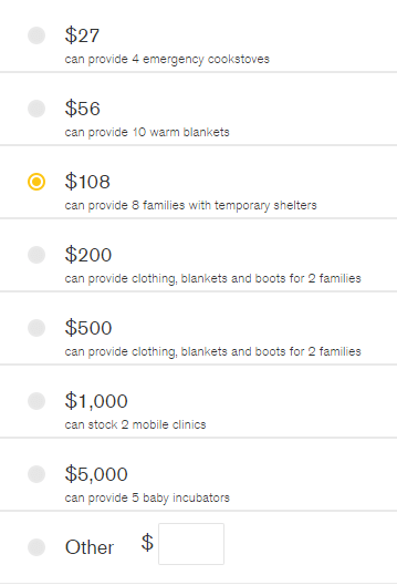
2. Specific data of what they can achieve with each donated amount (with figures that are not round in many cases, which increases the credibility that this is exactly the amount that is required to achieve that).
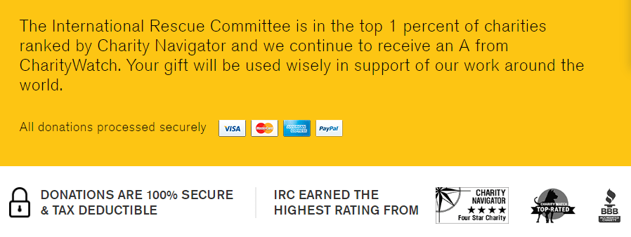
3. Seals of trust and payment security. Also phrases that add data to give even more confidence like “The International Rescue Committee is in the top 1 percent of charities ranked by Charity Navigator and we continue to receive an A from CharityWatch.“
4. Simplified design but keeping information and alternatives that may be relevant to the donor. Specifically, they remove the top menu but leave the footer (which includes the option to donate by phone, frequently asked questions, etc.).

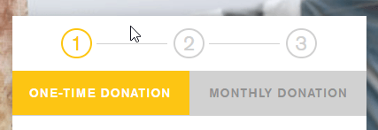
5. They indicate how the steps of the process (3) and you can easily go back to a previous step if you want to change something.
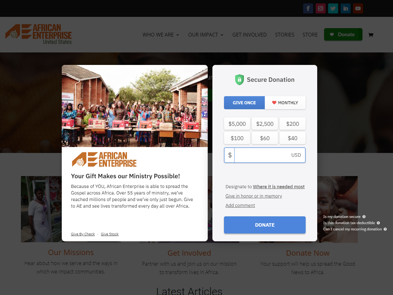
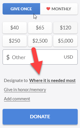
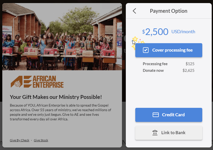
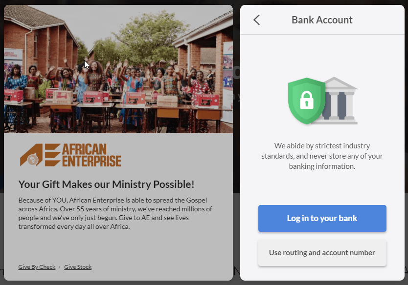
African Enterprise
1. Short and compact form, but at the same time it shows all the relevant information (photo, presentation, frequently asked questions, different donation options, option to add a comment or donate in memory of someone…)
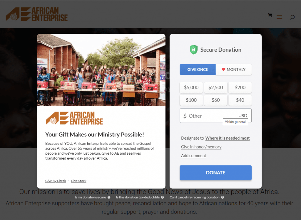
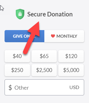
2. Payment/donation security is highlighted in several steps (there are still people who are wary of giving their card or bank details on a website).
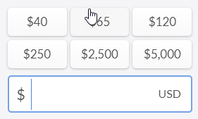
3. In the amounts to donate they show options with high values (up to $5,000). This can increase the average donation (if users see that low amounts are recommended by default, it is unlikely that they decide to type in a large amount).
4. Option to select which project you want to donate to, but marked by default “Where it is needed most” (which is usually the best option for the organization, since it gives it more flexibility to use the funds).
5. Option to cover the processing fee of the donation, marked by default (highly recommended so that 100% of the funds go to the cause and not “lose” 2-3% of fees)
6. Payment is requested before requesting personal data, so in the worst case (if the donor does not want to provide some data or does not fill some fields due to a problem), at least the organization will receive the donation, which is the most important thing (although legally in some countries and organizations it’s mandatory to identify donors).
7. They offer the possibility of paying by credit card or directly from the bank (few nonprofits offer this option)
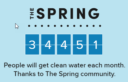
Charity: Water
1. They show the number of donors already participating in the initiative (more than 30,000), which generates trust and a feeling of belonging to a large community of people concerned about the cause.
2. Combination of information in text, images and video, so that each type of user can choose how they prefer to receive the information.
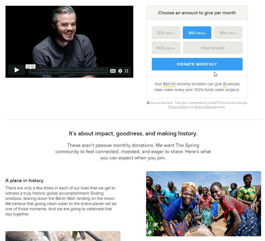
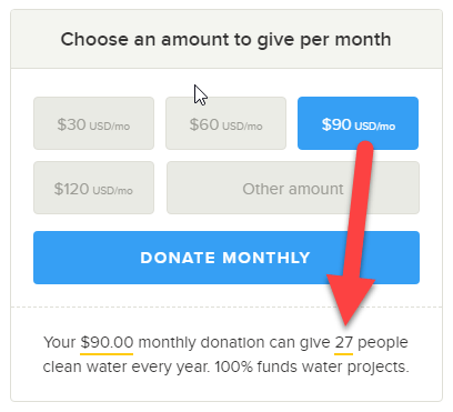
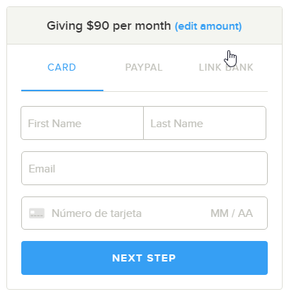
3. Information about the impact of your donation that is automatically personalized according to the amount selected in the form (eg. For $60 per month you help 18 people, for $90 to 27 people…)
4. They offer different payment methods (credit card, Paypal or direct debit) and highlight their preferred option (direct debit, because the organization pays fewer transaction fees).
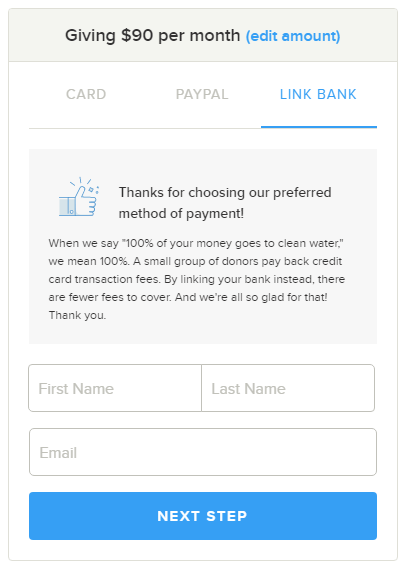
5. Form with very few fields (only name, email and card), to make the process easier for the donor (many organizations ask for too much data and even force donors to give “sensitive” information such as the number phone number, which many people prefer not to provide).
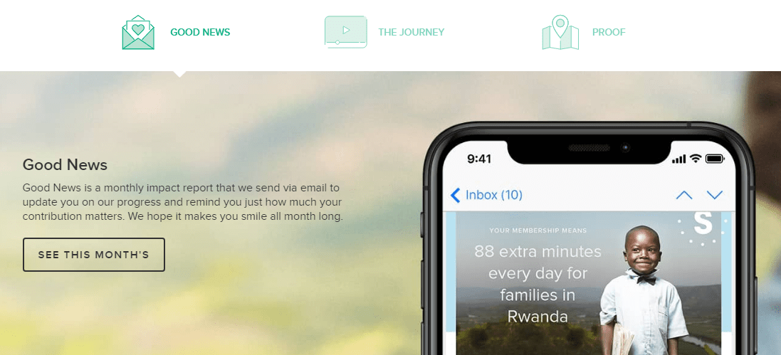
6. They provide very complete information on their initiatives (links to the latest monthly newsletter, videos…). A common mistake is asking for a donation without giving the potential donors enough information to really feel motivated by the cause and trust the organization.
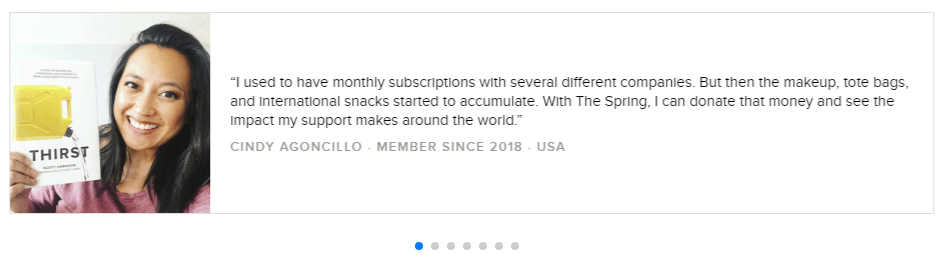
7. Donor testimonials, to give a more personal touch and generate extra trust in the organization.
8. At the end they show the option to subscribe to the newsletter, to maintain contact with potential donors (they may not be ready to donate at that moment, but they could be interested in receiving news and end up donating later)