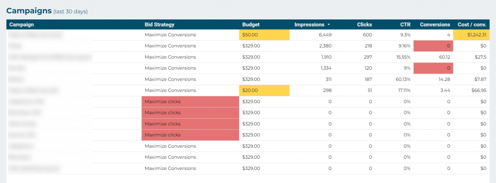
This dashboard is designed to more easily discover some configuration errors (mainly at the campaign level) and certain opportunities to improve results (for example, campaigns or keywords that bring traffic and consume budget but don’t achieve conversions).
It’s an interesting complement to the full dashboard. It shows some data in a different format (to highlight elements that may be causing “issues” or poor results) and also some data that does not appear in the full dashboard.
We recommend reviewing it with some frequency (at least once a month).
In the first section, 4 key metrics are displayed, with data from the last 30 and 90 days respectively. If any appear in orange, that might warrant a review; there may be opportunities for improvement. Red indicates that the data is even worse and there’s likely a problem. But these are indicative data; each organization is different and there may be accounts that are achieving their objectives despite seeing something in orange or red here.

Next, 3 tables are shown, following the same color criteria (orange is a “mild” warning and red is a more “serious” warning of possible problems/opportunities).

In this dashboard, the dates are predefined; you don’t choose them. The first 2 tables (campaigns and landing pages) show data from the last 30 days, and the last one (keywords) from the last 90 days. This is because the results of an account are typically divided among dozens or even hundreds of different keywords, so more time is needed for each word to have enough data to make reliable decisions (for example, if a word only has 10 impressions, you can’t judge its potential well, you need more time/data).
The tables are sorted by the criterion that facilitates analysis in general (e.g., “impressions”), but if you want to see the results sorted differently, you can change it by clicking on the title of the corresponding column.