To get good results in Google Ads (= many conversions), you need to succeed in 3 steps:
- Keywords that fit your goals and have a lot of traffic.
- Ads that are attractive to your target audience.
- Landing pages that convince the user to take the desired action (fill out a form, watch a video, complete a donation…).
It’s useless if you have the perfect configuration in Google Ads (good campaign structure, well-chosen keywords, convincing ads…) but then your website is not optimized (slow, poor design, does not offer what the ad promised, does not inspire trust… )
This topic would give for a complete course by itself, but we give you some tips to improve your landing pages:
8.1. Avoid using the homepage of your website for your ads
Usually the homepage contains many different contents, aimed at different audiences.
For your ads, you should use specific pages that speak only about 1 topic and focus on 1 goal.
To maximize conversions, all the steps must fit together (keyword > ad > landing page). Everything has to match exactly with what the user has searched for. For example:

Another example: If you are advertising for ”charity race” searches, your ad should focus on the charity race you are organizing and lead to a specific page with all the race details.
If you send them to your homepage, where you mention the race but also 10 other things, the user will be disoriented among so much irrelevant information and will probably leave your website quickly, without signing up for the race.
The exception may be brand searches (“branded keywords”), which is when the user searches on Google your organization’s name or something directly linked to it. In these cases, it’s usually not clear what the user is looking for, so the homepage can be the right destination for these ads.
But even for brand searches it can be interesting to test the homepage against an alternative landing page focused exclusively on the one goal (for example, getting donations or newsletter subscribers). And then analyze which one gets better results (that landing page or the homepage).
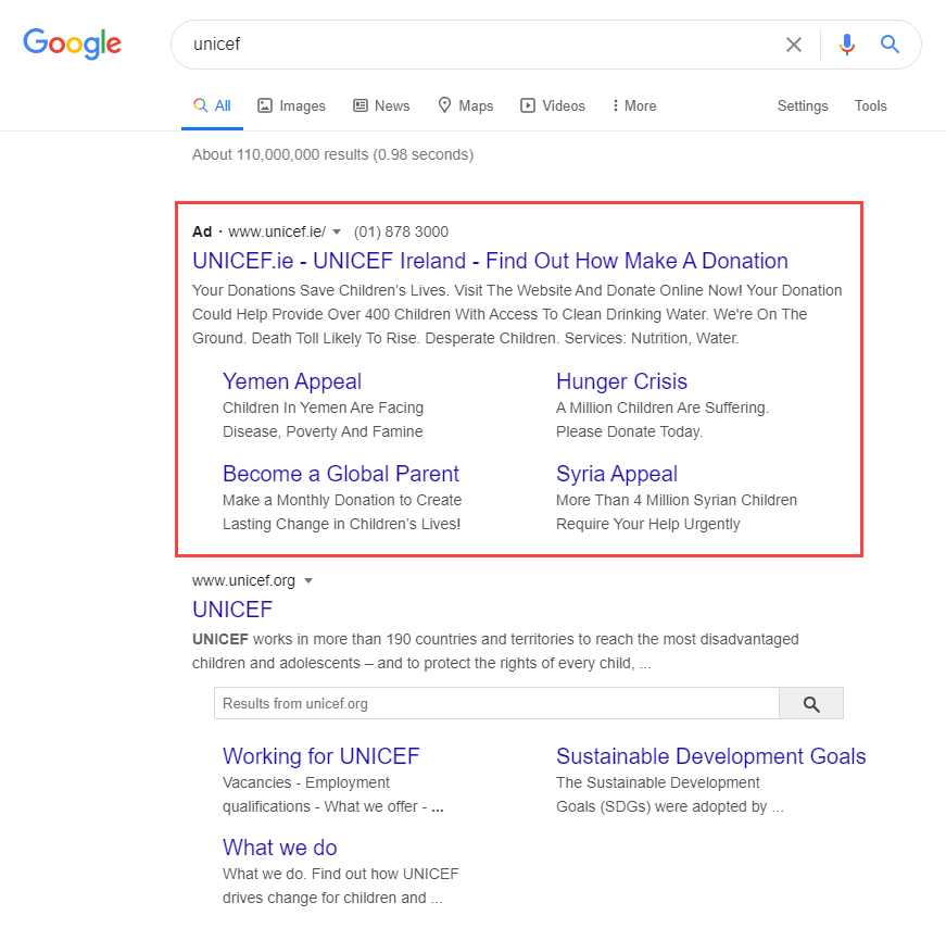
For example, UNICEF advertises for your name searches and highlights pages other than those shown in your organic result in the ad. Specifically, it gives more visibility in the ad to pages that interest them to capture income:
8.2. Check that all your landing pages have a prominent CTA
Every landing page has to highlight at least one Call-to-action (“CTA”).
It must be crystal clear for the user what is the next step they should take (donate, fill out a form, subscribe to a newsletter, share the content on social media…).
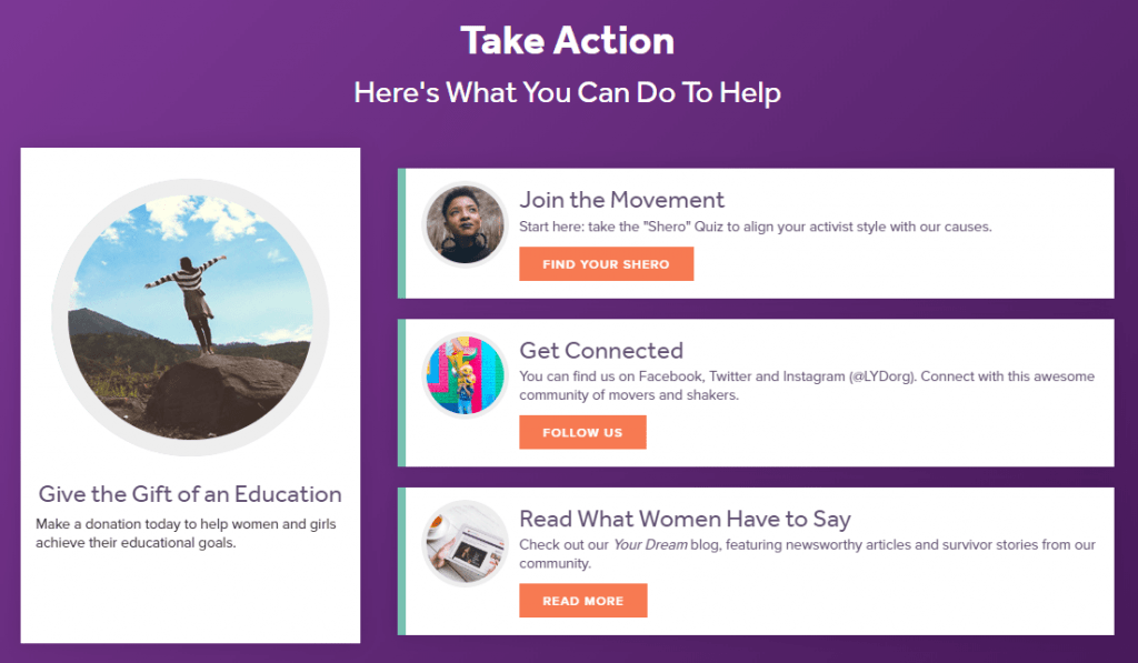
If you don’t emphasize enough what they should do, that will mean that fewer users will take that step and you will get fewer conversions.
Typically what works best for CTAs are big buttons with bright colors, but sometimes a normal link in the content itself can work even better (it feels more ”organic” and les ”pushy”).
On long pages, you should repeat the CTA several times throughout the page (perhaps combining links in the text itself and separate blocks or buttons that stand out visually).
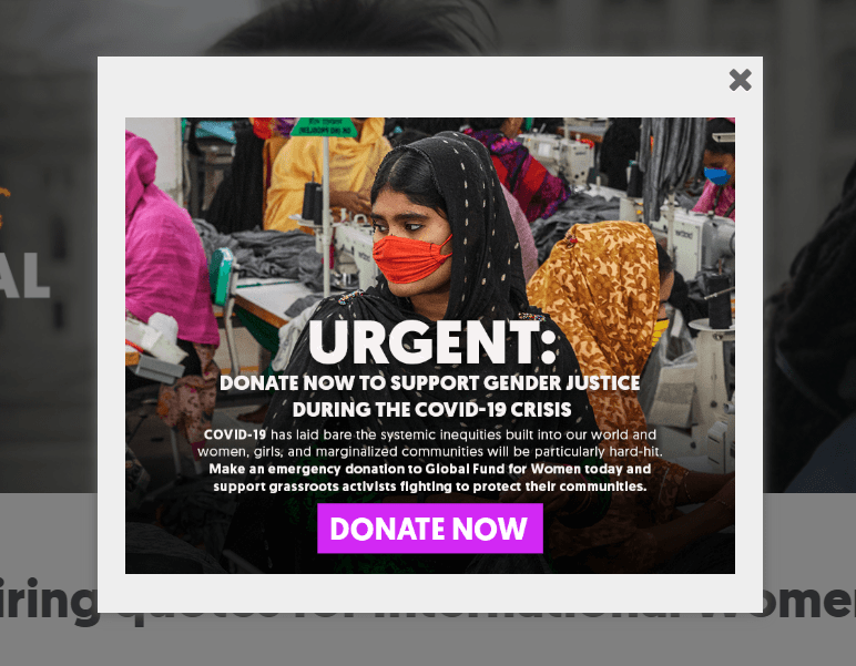
It can even be supplemented with a popup to make it even more eye-catching, so no one leaves the landing page without seeing the CTA. Popups are a more ”aggressive” solution (many users don’t like them, but they usually increase conversions), so they should be used with precaution to avoid damaging your image/brand.
8.3. Evaluate what is reasonable to ask the user for each keyword/search
You have to balance the goals of your organization with the needs of the user. If they don’t match, it will hurt conversions and even the reputation of your organization.
For example, let’s assume that you are an environmental nonprofit and the main goal of your Google Ad Grants campaigns is to get more donations.
If you advertise for the search ”donate to environmental nonprofit” it’s reasonable to ask them for a donation directly on the landing page (maybe explaining before what your nonprofit does precisely and why they should donate).
On the other hand, for the search ”recycling tips” it’s not reasonable to ask them directly for a donation. It’s not what they are looking for and probably almost none of the users who search that are willing to donate right then.
In these cases, you will probably get better results if you go step by step:
- First, show them an article with the information they are looking for.
- At the end of the article, offer them an option to learn more about your cause and/or keep in touch with your organization (sign up for the newsletter, sign a petition, watch a video and perhaps share it on social media…)
- Later on, ask them for actions that imply a greater commitment (donations, volunteering…). But only when they already know your organization well, not before.
These things need a ”courtship” period. It usually doesn’t work well if you ask them to ”marry” on the first date.
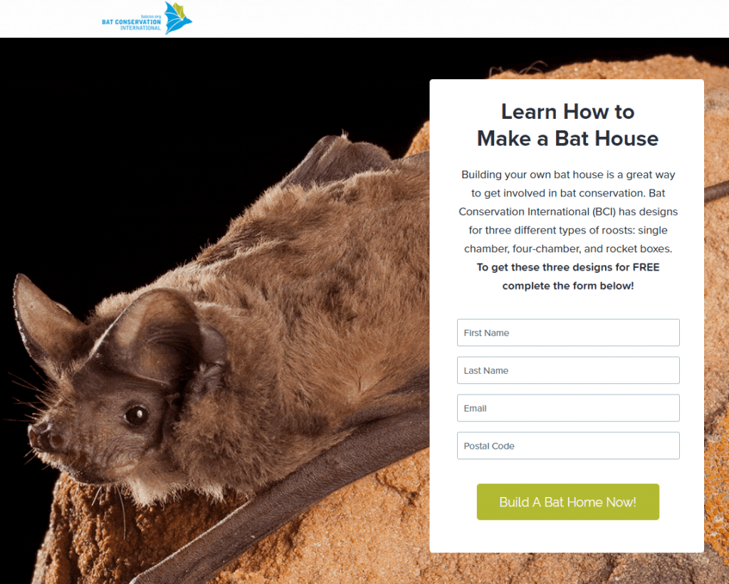
For example, BatCon offers free downloads of useful resources related to the user’s search. In exchange, they ask for the user’s email, name and zip code. They also show more information and an explanatory video below.
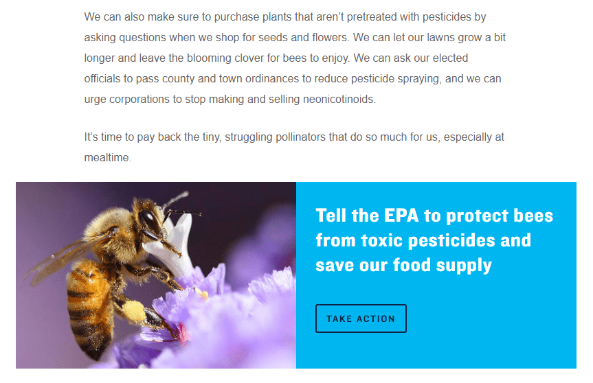
NRDC shows a highlighted block at the end of the informative article in which they invite you to take action (sign a petition related to the article):
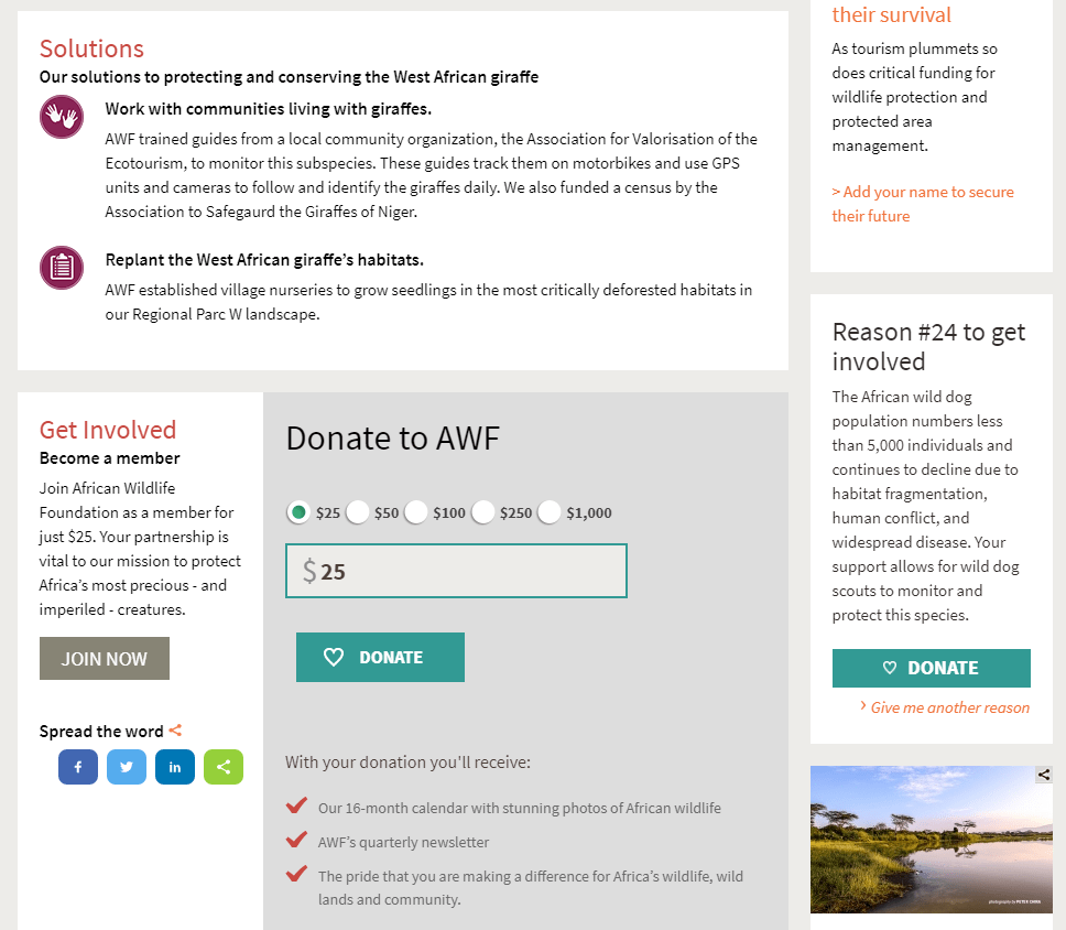
AWF goes one step further and asks for a direct donation at the bottom of an information page. It’s a bold ask, but they do it quite well because they present their solutions to that particular problem, reasons to donate, and exclusive benefits received by donors. They also give a secondary option to sign a petition (in case you’re not ready to donate yet):
8.4. Try different versions
Probably the first design you have created for a page is not the best possible, it’s difficult to hit the bull’s-eye in the first try.
If you don’t try multiple designs, you will never know if there is any version that brings you many more conversions.
Depending on the goal of each landing page, you should include different contents. But here are some useful concepts for most cases:
- Start with an eye-catching headline that grabs the user’s attention and matches what the ad mentioned.
- Explain the benefits of what you offer, in easy to understand terms (without abusing technical terms, acronyms or anything that may confuse the user).
- Use visuals whenever possible (many people don’t want to read a ”never-ending” wall of text, so better to mix it with images and videos).
- Provide trust elements (testimonials, press appearances, data about your organization and its programs…)
- Include calls to action, make clear to the users what their next step should be.
- Include the relevant legal information at the bottom of the page (name of your organization, identification number, address, contact details, privacy policy…). It can make the user trust you more (they know who is behind the website) and you can have problems with Google if that information does not appear on your landing pages.
- If it’s not easy to create attractive landing pages using your current website software, you can resort to specific tools such as Unbounce or Leadpages.
A good landing page example is this one from Pathfinder. They advertise for AIDS-related searches and use a very complete landing page:
- First, they present interesting facts about the problem.
- Then they present the initiatives carried out by their organization to fight the problem (with links to specific projects for those who want more details)
- They also feature other articles related to the topic (this is not always recommended, you can lose conversions if you make users read a lot and they ”forget” to take action)
- They then introduce their staff (they put ”faces” to the organization, a good measure to increase user’s trust)
- At the end of the page, once the user has all the information, they give 3 different options to collaborate: Donate, become a advocate of the cause or share the page on social media.
- Finally, in the page footer, they show a form to sign up for news related to the topic (very useful to keep in touch with those who are not yet ready to become donors or collaborators).
