What gets measured gets improved.
The first thing we have to do is to make sure that we accurately measure the entire online donation process.
Here we are going to focus on Google Analytics, since it is a free tool, very powerful and used by most organizations. But there are tools that offer similar features, such as Adobe Analytics. There are also more simple tools and focused on user privacy, such as Simple Analytics and Matomo.
We present the configuration tasks ordered by priority (first the most critical, last the “optional” ones).
Install Google Analytics
Obviously, this is an essential step. If you have not already installed it on your website, you can follow this official guide.
A couple of important notes:
- Make sure it’s installed on all pages of your website. For example, if you use a different system for the blog or the donation pages, you probably have to configure Google Analytics on each system, it’s not enough to install it only on the “main website”.
- You may be interested in installing Google Analytics through Google Tag Manager (GTM). GTM offers more flexibility. You can make changes and install other tools without having to touch the code of your website and annoy your web developers every time you want to change something. But if you have a simple website made with WordPress, you may want to simply install a Google Analytics plugin like this and forget about GTM.
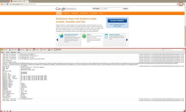
- If you have doubts about whether Google Analytics is working correctly, you can use the official Chrome extension called Google Analytics Debugger to detect possible errors (also available for Firefox).
Google Analytics has hundreds of options. If you are not sure if you are doing everything right, you can:
- read the official Google Analytics documentation
- read articles explaining most common Google Analytics errors like this one and this one
- or contact a Google Analytics specialist (like us)
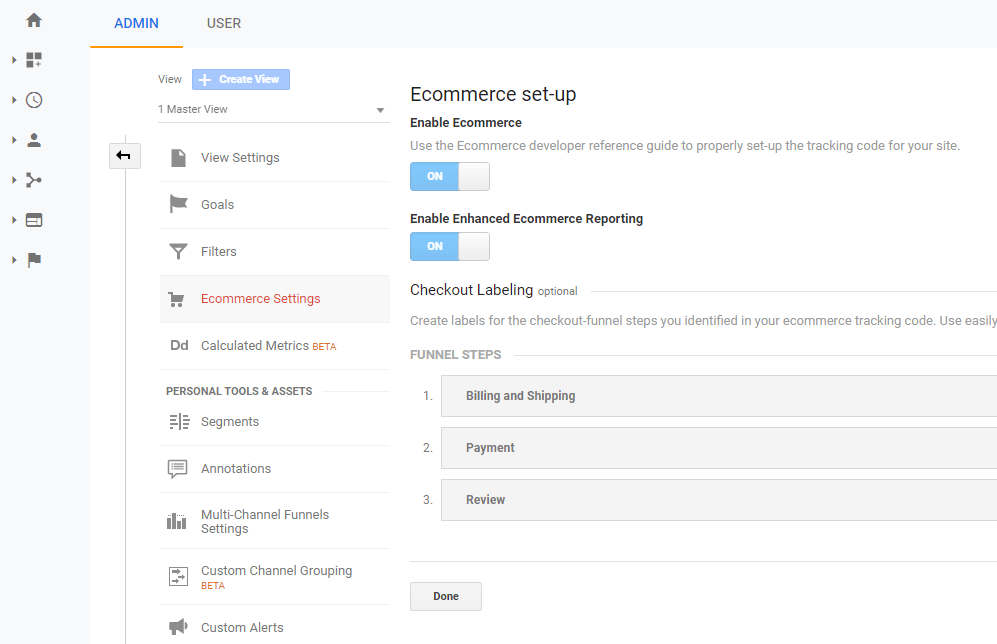
Set up ecommerce tracking
If your organization receives donations online or sells anything on its website (merchandising, services, tickets for events…), you should configure ecommerce tracking in Google Analytics.
That will allow you to register each donation (as “sales”) and provides specific reports and features to analyze the donations received (you will amounts donated, average donations, countries or devices that bring more donations, etc. ).
To configure ecommerce tracking, you can follow the official guide.
Depending on the tools you use for your website to receive donations, the steps to configure it will be somewhat different:
- If you use WordPress/WooCommerce, you can easily configure it using a plugin like this.
- If you use an external donation software (e.g., Donorbox), they usually offer simple integration with Google Analytics, ask the software vendor or look at their documentation.
- If you use your own system to receive donations, you probably have to add additional code to send the data of each completed donation to Google Analytics.
An alternative is to measure donations as Goals rather than as sales, in which case having ecommerce tracking activated would not be essential. This is a worse solution, because ecommerce tracking allows you to send more information about each donation and gives access to more features in Google Analytics, but it’s a simpler option and for some nonprofits it may be enough.
In fact, the ideal configuration is to record donations as both things: as a goal and also as a sale. With this configuration, we can use different reports according to what we want to analyze and we have “emergency” data available if 1 of the 2 systems stops working.
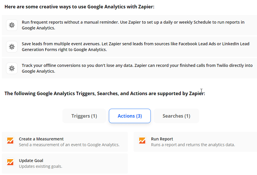
Activate integration with other tools
Google Analytics can be integrated with many tools (Google sends information about what users do on the website and/or vice versa).
It’s quite useful to have this extra information on and it’s usually easy to configure it (for most tools, it merely involves a couple of clicks in the configuration panel of the tool in question), so we recommend activating all the integrations that you have available.
Sometimes there is no direct integration, but intermediate services such as Zapier or Integromat must be used to transmit the data. In that case you will have to evaluate if the extra information that you are going to get it’s worth the time/effort of this indirect integration.
Some tools that are interesting to integrate with Google Analytics:
- Google Ads
- Google Search Console
- CRM (e.g., Salesforce)
- Donor management (e.g., Bloomerang)
- Online chat (e.g., Olark)
- Call Tracking (e.g., CallRail)
- Email marketing (e.g., Mailchimp)
- Forms/surveys (e.g., Typeform)
- A/B testing (e.g., Google Optimize)
Measure events
Google Analytics allows you to measure every time a user performs a certain action on your website that is important for your organization, such as:
- Click on a certain button
- Complete a form
- Visit a certain page
- Interact with a certain element of the page (a video, online chat …)
That gives us extra information about what the users are doing. It helps to detect problems and areas of improvement.
There are many possible events that can be interesting to measure, it depends on the objectives of each organization and the contents of their websites.
For example, it is useful to increase donations:
A) Measure the clicks on the donate buttons (using the parameters of the Google Analytics event to differentiate each button).
By measuring this, we can find out thinks like what % of users who click on the donate buttons end up completing the donation or if some buttons bring more donations than others.
This is what they do in Humans Right Watch (they identify each donation button separately), although their technical implementation is different (they use parameters in the URLs, adding for example “? Promo_id = 1005”, not Google Analytics events).
If you have a special process for other ways to contribute (big donations via bank transfer, fundrasing events…), we recommend to count the clicks on the links or buttons that lead to that pages. For example, bank transfers are not registered in Google Analytics, but this way at least you will register how many users have been interested in that option (and maybe not completed their donation online because they did it via bank transfer).
B) Measure each time a user fills in a certain form (to subscribe to the newsletter, sign up for an event, register as a volunteer, request information…).
In this way, you can evaluate (among other things) how many users who fill a certain form end up donating. With that information, we may decide we should focus on promoting these forms/actions more, instead of focusing on asking for donations directly.
The tool you use for your forms probably has an option to send automatically an event to Google Analytics each time the form is submitted. Or it can redirect to a special confirmation page when the form has been submitted (a “thank-you page”), which we can measure as a goal in Google Analytics.
Check Google Analytics data
It is relatively common to find out that Google Analytics is not counting all the donations, visitors or events of a website correctly.
Therefore, we recommend checking the reliability of your Google Analytics data, especially data related to donations received.
You can compare the data of your donation system or the bank account with the donations that appear in the Google Analytics reports (you can check the daily totals and also one by one each donation in the “Transactions” report within from the e-commerce section)
There is usually a small deviation between the donations actually received and what Google Analytics shows, but if it’s greater than 10% there are probably configuration problems.
We recommend reviewing it again every 6-12 months and also after making any significant change on the website or in the Google Analytics configuration.
Configure custom reports
You can do many analyses using the reports that Google Analytics offers by default, but by creating custom reports you can do your analyses more efficiently and quickly (they allow you to see all the metrics you need about a specific aspect in a single report).
Ideally, you will create your own reports based on the specific needs of your organization, but we give you several reports that you can use as a good starting point (they require having ecommerce tracking activated to be useful):
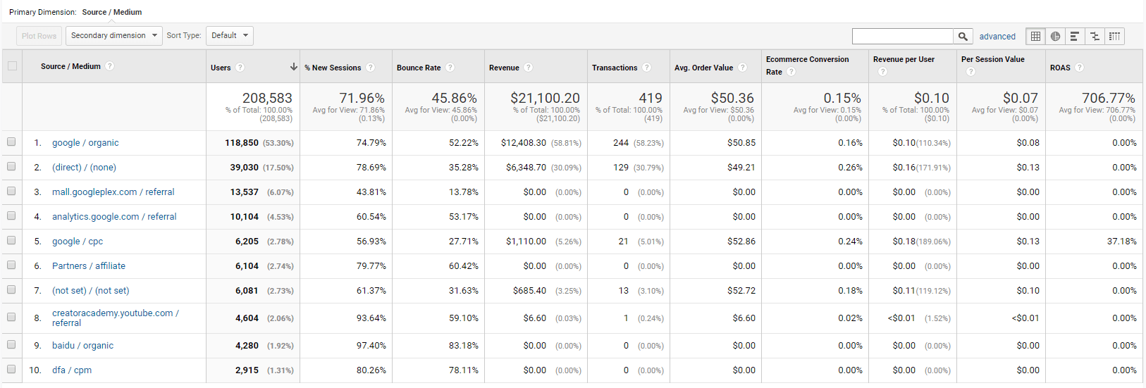
- Donations by traffic source
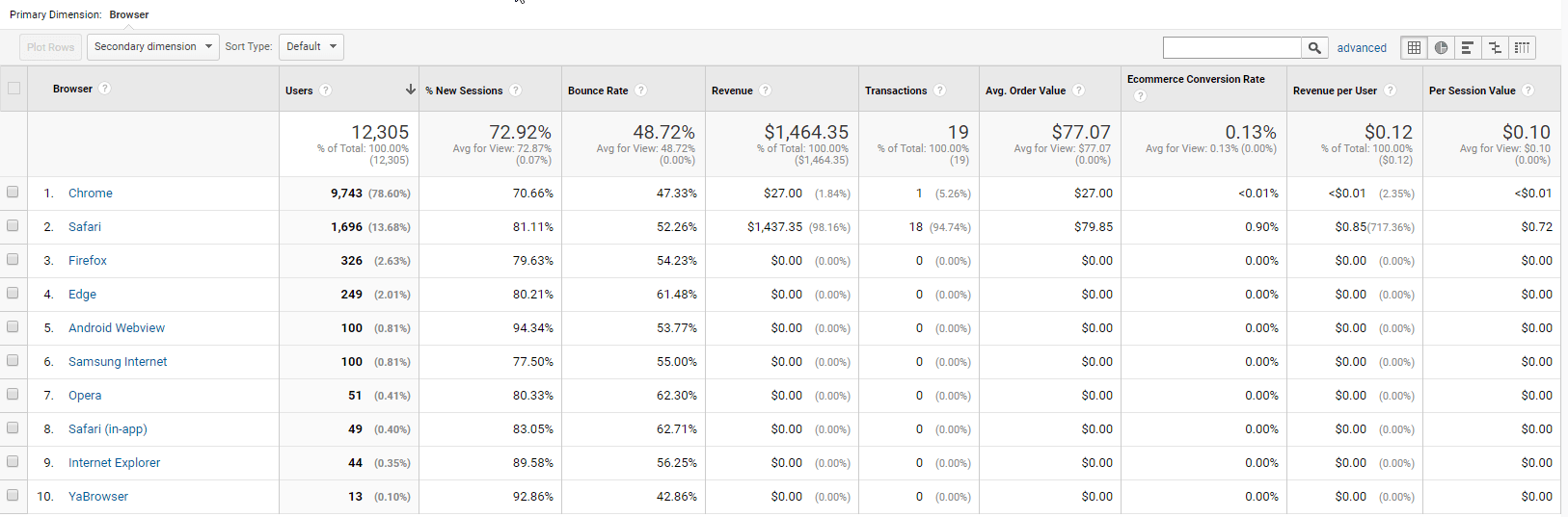
- Donations by browser and device
- Donations by landing page
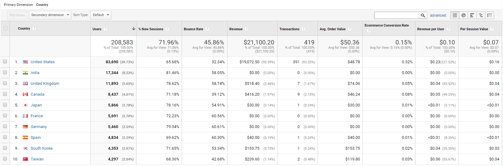
- Donations by country
- Donations by page folder
Google Analytics offers similar reports, but in these custom reports we remove some metrics that are generally not essential and add some that may be important to discover how to increase donations, such as:
- “Avg. Order value”, to know if there are certain sources that bring larger donors (users who donate more money) than others.
- “Revenue per user” and “per session value”, to know the value of each user and session. Among other things, you can learn what campaigns or countries bring more valuable users.
- “ROAS”, to know the profitability of advertising campaigns (only applies to traffic sources that send their costs to Google Analytics, like Google Ads, which appears as “google / cpc”).
- “% of new sessions”, to know if a source is bringing new users/donors or most of them already knew your nonprofit.
- “Page value” to know which pages have managed to bring more value of donations (it does not mean that they have donated directly on that page, but have ended up donating after visiting that page at some point).
If you want to analyze other issues that are not in the reports offered by Google Analytics, you can take a look at the gallery of personalized reports shared by different users. There are specific reports for SEO analysis, ads, emails, page speed…
It shows which traffic sources have brought more users and donations.
If you click on a traffic source of type “referral” (visits coming from “normal” websites, not search engines or social networks), it will show you from which specific pages those visits have come.
It is vital to know where donations are coming from and what marketing initiatives are profitable.
It shows which browsers have brought more users and donations.
If you click on a browser, it will divide it by device types that have used that browser to access your website (desktop, tablets or mobile).
If you click on tablets or mobiles, it will show you specific devices.
It’s interesting to discover if there are certain browsers or devices that have an unusually high bounce rate or low value per user, which could indicate that your website does not work correctly on those devices/browsers.
It’s usual to have a better conversion rate on desktop than on tablets and mobiles. Still, you should try to make the difference smaller, because mobile devices are or will soon be the main source of visitors/donations for most nonprofits.
It shows which countries have brought more donations.
If you click on any of the countries, it will divide it by regions of that country. If you click on a region, it will divide it by cities of that region.
It is interesting to analyze which countries have more potential. For example, if a country brings many donations without promotional campaigns for that country or without translating the contents to their local language, perhaps you should invest in campaigns and translation for that country.
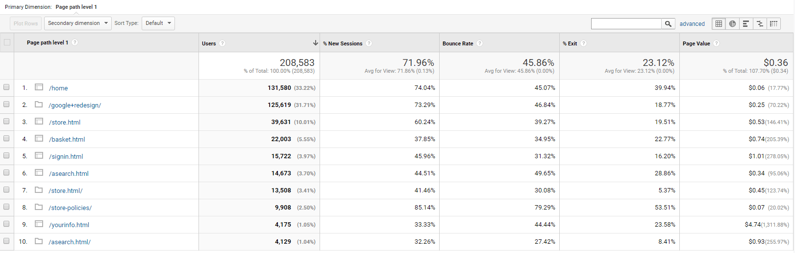
Show what sections of your website receive more visits.
If you click on any of the sections, it will divide it by subsections and if you click again on specific pages within that subsection.
It is interesting to know which pages are most visited and which ones lead more donations (higher page value).
For example, if your blog has a very high value per visit, it could be beneficial to take more people to the blog. By giving more visibility to the blog on your website, you could increase donations.
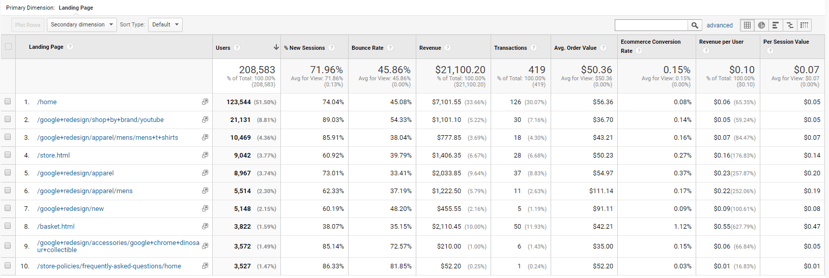
It shows which pages are the first ones that users visit on your website (where they arrive) and how many donations the users who arrive at each of those pages end up giving.
If you click on any page, you will see which traffic sources sent the visitors to that page.
It is interesting to know if there are landing pages that are working exceptionally well or poorly.
For example, if a page has a very high bounce rate and a very low value per visit, it means that something is wrong with that page (or maybe it’s receiving low-quality traffic). That page should probably be redesigned.
Set up custom segments in Google Analytics
By default, reports give you an average of what all users who visit your website do. This is interesting, but it can make you overlook a lot of interesting information about certain specific user segments that may not behave like the rest.
For example, large donors may come mostly from certain countries or traffic sources, but you wouldn’t know that if you look at reports without segmentation.
Therefore, it’s crucial to use segments offered by Google Analytics by default and we also recommend creating custom segments according to the characteristics of your organization.
We suggest some segments that may be useful to analyze current donors and increase future donations:
Buyers
This segment comes by default in Google Analytics (although for it to work, you must have configured ecommerce tracking). For nonprofits, “buyers” means donors (unless you also sell products on your website).
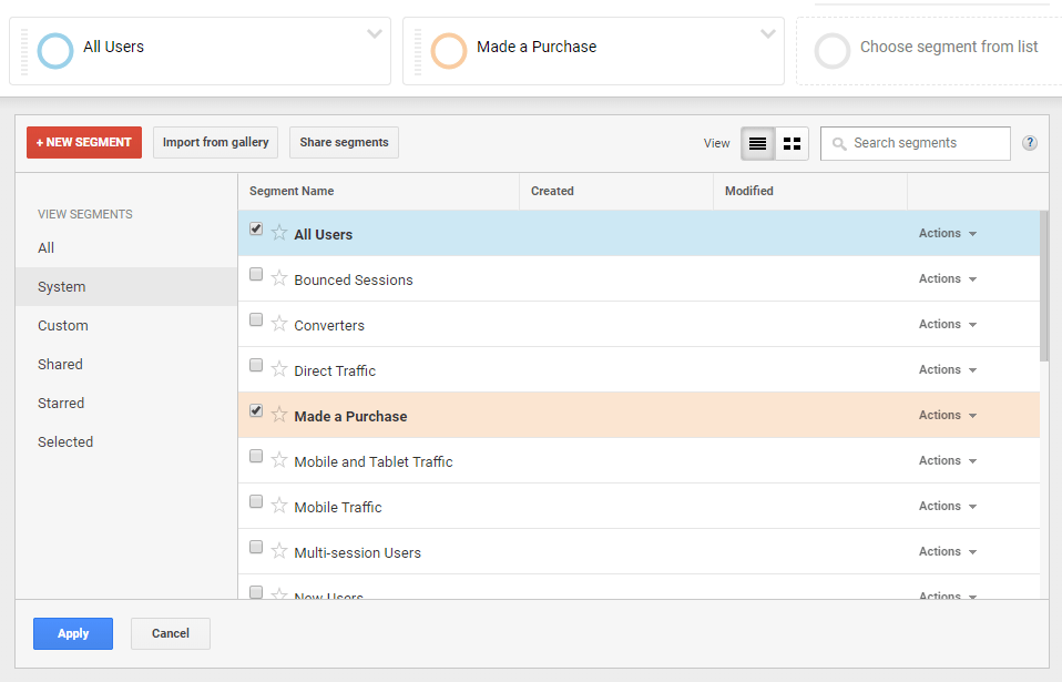
Applying this segment and comparing it with the general segment (“All users”) is interesting in virtually any report. For example, you can discover if donors have visited certain pages a lot or performed certain actions/events (such as subscribing to the newsletter or filling out a specific form).
You can also learn if users frequently donate on their first visit or if they usually visit the website several times before donating (which could indicate that we can improve results if we ask them for their emails to maintain contact or give them more information instead of asking them the donation directly).
Big donors
This is a custom segment. You can create it by setting a “Revenue” filter with a value greater than $500 for example (or whatever you consider a large donation in your organization).
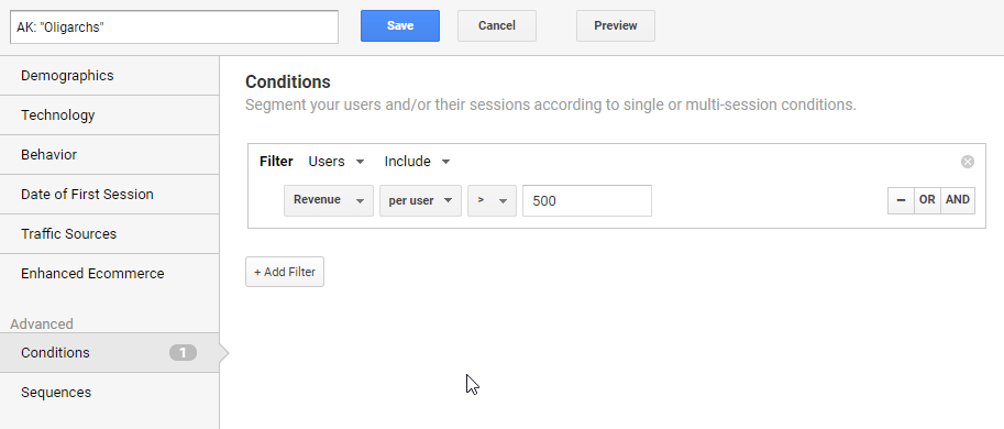
If select “User” it will add all the donations made by that user/donor (as long as she is using the same device/browser), which is usually more interesting than counting each donation of the same user separately.
This segment is useful for most reports. We could discover, for example, that large donors often visit the web from a certain device or a certain region. With that information, we could create new campaigns focused on those devices or regions.
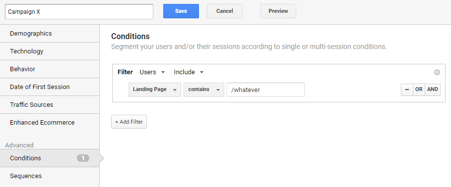
Visits from a specific campaign
You need a custom segment for this. You have to select the filter of “Landing page” = /whatever (the URL used by that campaign). Or if we have used UTM tags in the links of the campaign, it could be filtered by the “campaign” field.
Using this segment you can analyze how visitors from a specific campaign behave. For example, if you have sent a newsletter to promote one article, thanks to this segment you could see:
- What pages they have visited after reading the article
- From which countries they have come
- On which devices they have opened the campaign
- How long they have been on the web
- If they have ended up donating
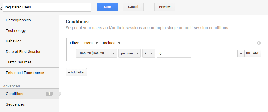
Users who have completed an event/goal
For example, we could configure it to segment users who have watched a certain video. If we discover that the majority users who have seen that video end up doing other valuable actions (make a donation, sign up as volunteers…), we probably should give the video more visibility (on the website, ad campaigns and emails).
Another example: If we have an online chat on the web, we can check if users that chat end up donation more than the rest of users. If that’s not the case, we may want to stop offering that chat, to save the time and resources that we were investing in it.
Configure custom dashboards
Dashboards allow you to review at a glance several key metrics, so you can make daily or weekly checks and detect in a few seconds if something strange is happening (and then check it in detail in a report).
The information that a dashboard should collect depends a lot on what is most important for each organization, but we give you a panel that can be interesting to check the evolution of the main metrics related to donations.
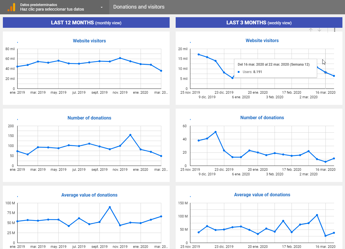
This dashboard shows the evolution of key metrics such as visitors, total donations, average donation and donation per visitor. You can access it at https://datastudio.google.com/reporting/e116d782-83cb-4aa3-a7b8-f96c760813cd
We recommend you create a copy and customize it with your metrics (and also with the colors and logo of your organization if you want). Once you choose the Google Analytics view of your website, this report will be updated automatically with the latest available data, without you having to do anything else.
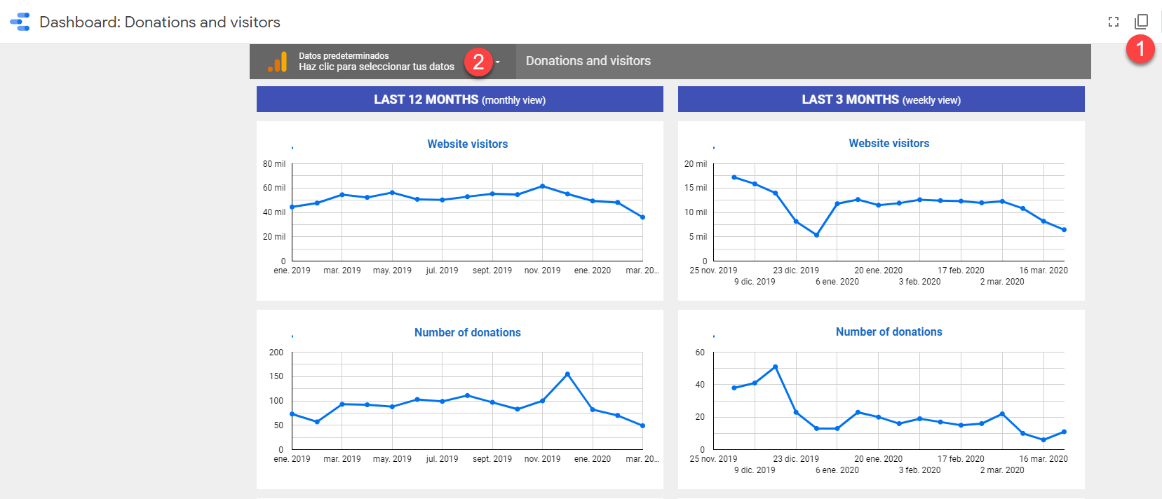
It’s created with Google Data Studio (free tool), not with the dashboards feature inside Google Analytics, because Google Data Studio offers much more flexibility (it allows filtering and displaying data in more different ways, it allows integrating data from Google Analytics and other tools in the same panel, allows you to share the panel with other people without having to give them access to your Google Analytics account…).
There are many ways to display information on a panel (specific figures, data tables, maps, evolution graphs…).
Our report focuses on the evolution graphs. We consider that showing concrete figures is less useful in general (they give us information only for 1 specific period, doesn’t show how metrics have evolved over time). Tables and maps complicate the panel without giving all the necessary information.
Our dashboard is not as beautiful as the panels that show a bit of everything (maps, bars, big numbers…), but in our opinion, it is much more useful.
Configure custom alerts
Panels and reports are fine to review from time to time, but it is not feasible to review all metrics daily.
Therefore, it is interesting to configure custom alerts in Google Analytics, so the tool sends us an automatic alert every time certain values have gone up or down a lot compared to normal.
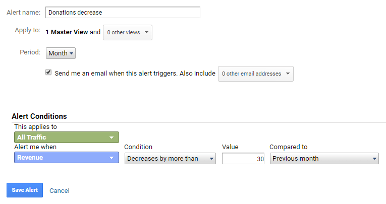
Some examples of custom alerts that are often useful are:
- Revenues in the last month have risen more than X% compared to the previous month
- Average purchase value (average donation) has risen more than X% compared to the previous month
- Visits or donations from a certain source have dropped more than X% compared to the previous week (for example, to find out if a Google Ads advertising campaign has stopped working)
- Average loading time has risen more than X% (to find out if the web is slowing down, which can affect donations, user satisfaction, etc.).
- Web errors have risen more than X% (to find out if the website is suddenly giving a lot of errors. This requires knowing how errors are displayed on your website and how to measure them in Google Analytics (some CMS can send events to Google Analytics with details of each error, others send users to an error page style /404.html…)
CLARIFICATION: We put X% because the ideal percentage will depend on how much variation is standard on your website; you should be notified every time the variation is clearly not normal. If it’s notifying you every week it will not be a useful warning and will end up being ignored. You can try first with a small % and if the alert jumps too often increase the %.
You should think about what things you would like to know each time they happen (especially things that would have a great impact on donations) and then check how to set that alert.
Google also offers smart alerts that automatically detect significant changes in any relevant metric. Since there are thousands of variables that are measured in Google Analytics and it is not feasible to manually create alerts for all of them, these smart alerts are a good complement to custom alerts (many of the smart alerts will not be relevant, but once in a while they will discover something interesting that probably would have gone unnoticed without them)
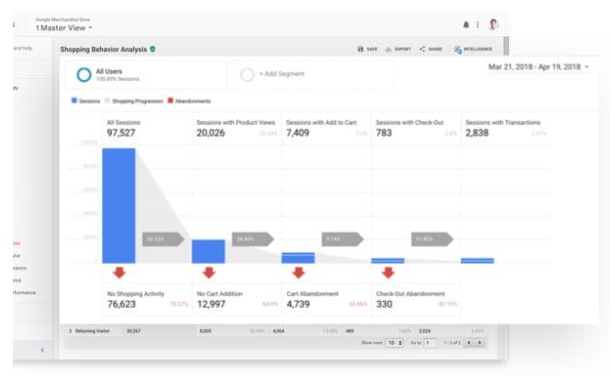
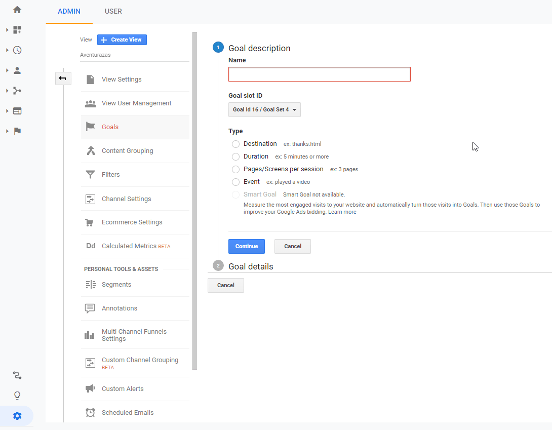
Configure the funnel
If your donation process has several steps (the entire form is not presented at once), it is interesting to measure the conversion funnel in Google Analytics. That allows you to see if there is a high % of users who “get stuck” in one step and you can focus on improving that step.
If every step of the donation process generates a different URL on your website (e.g., www.tuweb.com/paso1 , www.tuweb.com/paso2… ) it is easy to configure the funnel in the “create new goal” section (Within the “Administration” section). You will have to select the “Goal type: Funnel” option, then activate the “Funnel: ON” option and finally, enter the URLs of each step. For more details, you can look at the official guide.
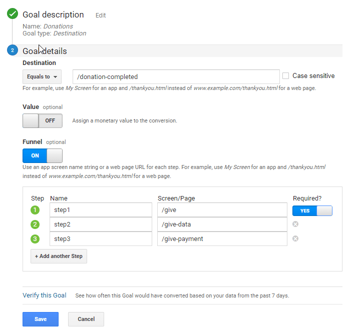
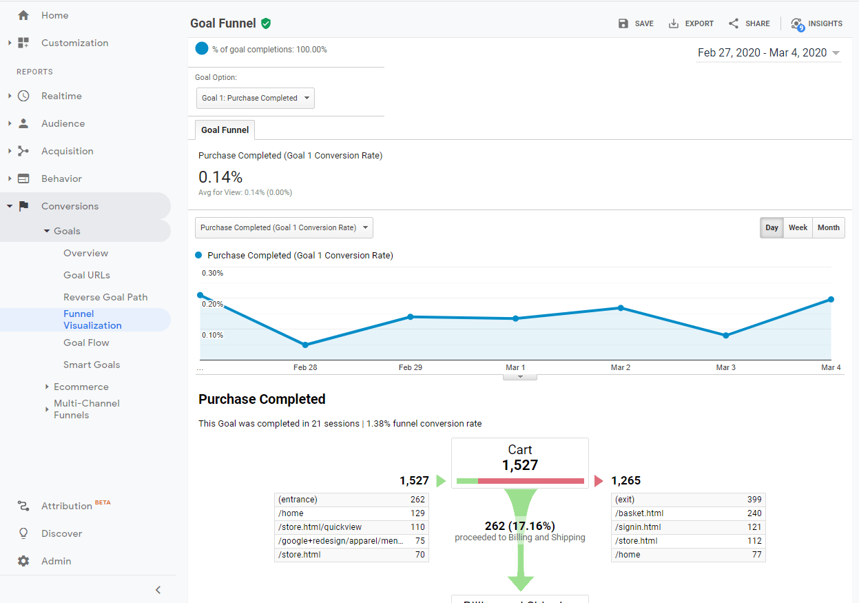
You will see the funnel statistics in the “Funnel visualization” report (you will find it in the “Conversions” section, “Goals” subsection). You can also create custom funnel reports (see instructions).
If you use a donation software or plugin that integrates with Google Analytics ecommerce tracking, you may already be automatically sending the data from each step to the “Checkout behavior” and/or “Shopping behavior” report. You will find them within the “Conversions” section, “Ecommerce” subsection.
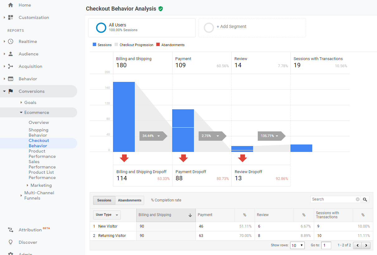
If there are no data in those reports, you can contact the technical support of the donation software you use to ask them if they offer that option and how to activate it.
Record heatmaps and/or session recordings
This is not something that Google Analytics offers. With tools like Hotjar you can record how users are browsing your website or certain pages.
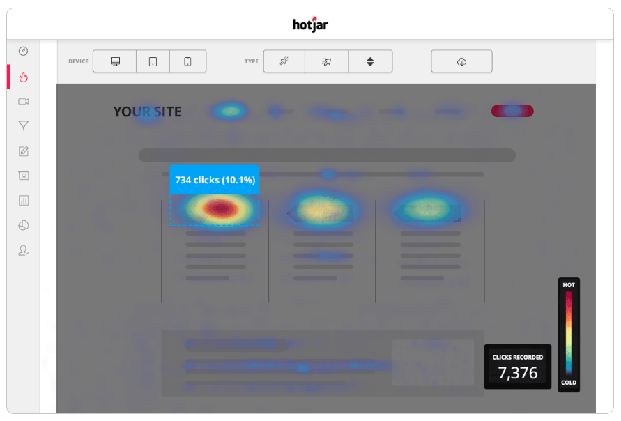
- Heatmaps join all the visits received on a page to show where the users have moved their mouse and clicked.
- Recordings are videos that show everything that specific users have done on your website.
They can allow you to see things like:
- What percentage of users really see all the page, scrolling down to the bottom. For example, you can discover that most only see the top, in which case everything you put below has no effect on users.
- Which elements of a page are clicked more frequently. For example, you can discover that many users are trying to click on an image that you really do not have configured as a link. Or that almost everyone clicks on a specific button and ignores the others.
In general, we recommend heatmaps above recordings. It is less invasive of user privacy and much faster to review (a heatmap can be analyzed in a few seconds while watching many recordings can take hours).
But if your donation process has poor results and you don’t find the problem using other tools, recordings can be an excellent resource.