We divide the recommendations of this guide into 3 sections:
- Essential: Key concepts that every website should have. Without them, you are probably losing donations.
- Recommended: Important concepts, but more complicated to implement or with less potential impact on donations.
- Other ideas: Interesting concepts that can increase donations, but will not work for all organizations. Great for A/B tests.
ESSENTIAL
Review and improve your loading speed
If your page takes more than 3 seconds to load, it’s making you lose some donations.
Nowadays, people have very little patience with slow websites. According to Google data, you can lose up to 20% of conversions (donations) for every extra second of loading time.
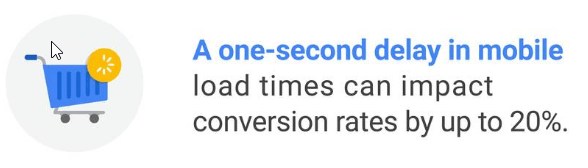
So you could increase online donations by 20% by merely improving the loading speed of your Web by 1 second.
And even if you don’t see that great donations increase, it is good to have a speedy website (more satisfied users/donors, better SEO…).
To measure and improve the speed of your website, we recommend these free tools:
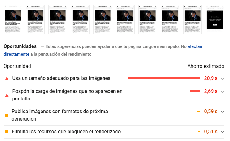
Check your website with Google PageSpeed Insights
It usually gives good tips for improvement. Useful and relatively easy to understand.
Check your website with GTMetrix
This tool gives more technical information. For example, the “Waterfall” tab, that measures exactly how long it takes to load each element of your website and detect if there is something that is slowing down a lot.

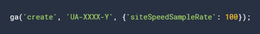
Review Google Analytics speed reports
Here you can see what is the real speed of your website, with data from real visitors. You can analyze if certain pages are unusually slow and if it is worse in specific devices or countries.
NOTE: By default, Google Analytics takes speed records only for 1% of visitors. If you want to count the 100% and have more reliable data, you have to change the siteSpeedSampleRate parameter to 100. You can change it in the Google Analytics code itself, or maybe the plugin/extension that your website is using for Google Analytics has an option for that (look at the advanced configuration settings).
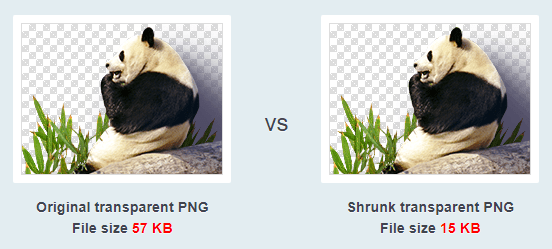
Use an image compressor
Compressors make images lighter (less disk space), so they load faster, even without losing quality. There are many options, including free online services such as TinyPNG and Compressor.io.
Many other measures can help improve the loading speed, but they are more technically complex and/or costly, such as:
- Migrate the Web to a faster (and usually more expensive) hosting
- Use CDNs like Cloudflare
- Use services or cache plugins (for example W3 Total Cache if you use WordPress)
- Group and minimize CSS and Javascript files
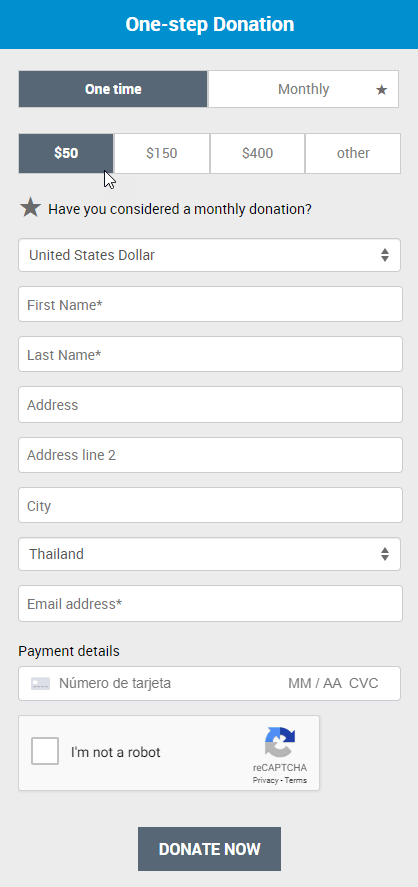
Improve the usability of the donation form
We must make life easier for the potential donor. If the experience of donating on your website is frustrating or confusing, many of them will give up and your organization will lose donations.
It is generally not necessary to change the tool you use to receive donations, but simply make sure that your online donation forms meet some basic requirements:
- Remove all fields that are not essential, do not ask for more information than you really need. Several experiments have shown that if you ask for more fields in a form, usually fewer people complete that form (and that means fewer donations here).
- Guide the user. If there are fields where people get stuck or need an explanation, add information that guides them (below the field, in an explanatory popup that opens or where it fits best).
- Manage errors properly. Try all the fields on your form and see what error messages they show when they are not completed correctly. Avoid generic messages like “There has been an error”, show precisely what error has happened and how to fix it.
- Offer a modern and professional design. If your form has a bad appearance, it could raise mistrust on some potential donors and they could decide not to donate.
Example: https://www.unfpa.org/donate
Optimize the mobile page
A frequent mistake that designers make is that they create websites on computers and they leave the adaptation for other devices (mobiles and tablets) as something secondary.
For many NGOs, visits and donations from mobile devices already account for more than 50% (and the percentage is only growing), so much more attention should be paid to the mobile donation experience.
Some essential recommendations:
Make sure your web design is responsive
A good responsive design adapts perfectly to different screen sizes. Among other things:
- Font sizes readable in small screens.
- Large buttons and form elements (so the users can tap on them with their fingers easily).
- Top menu that is visible enough and opens correctly in all mobile devices.
- Well-thought orde
- r for the different content blocks (for example, if a side block must go on mobile before or after main content).
Adapt content specifically for mobile
It is not enough that the design and structure of your website adapt to mobile devices, the contents of each page must also be adapted (especially the most important ones such as the home page and the donation page).
For example, in small screens, it is challenging to see some images or tables, so you should show mobile-friendly alternatives or directly hide those contents on small screens.
In general, mobile users have less “patience”, so it is common for simpler versions to work better (shorter texts, fewer options…).
E.g., NeverThirst simplifies the donation form (removing the image and the text on the left) and leaves only the most important element (the donation form itself).
Version for large screens:

Mobile version:
Analyze the behavior from mobile phones separately
When analyzing website stats or A/B test results, you should segment visits from computers, tablets and mobiles.
It is quite common to discover pages or campaigns that work great for computers but give bad results for mobile (or vice versa).
Detecting what works best in each type of device is key to improving overall results.
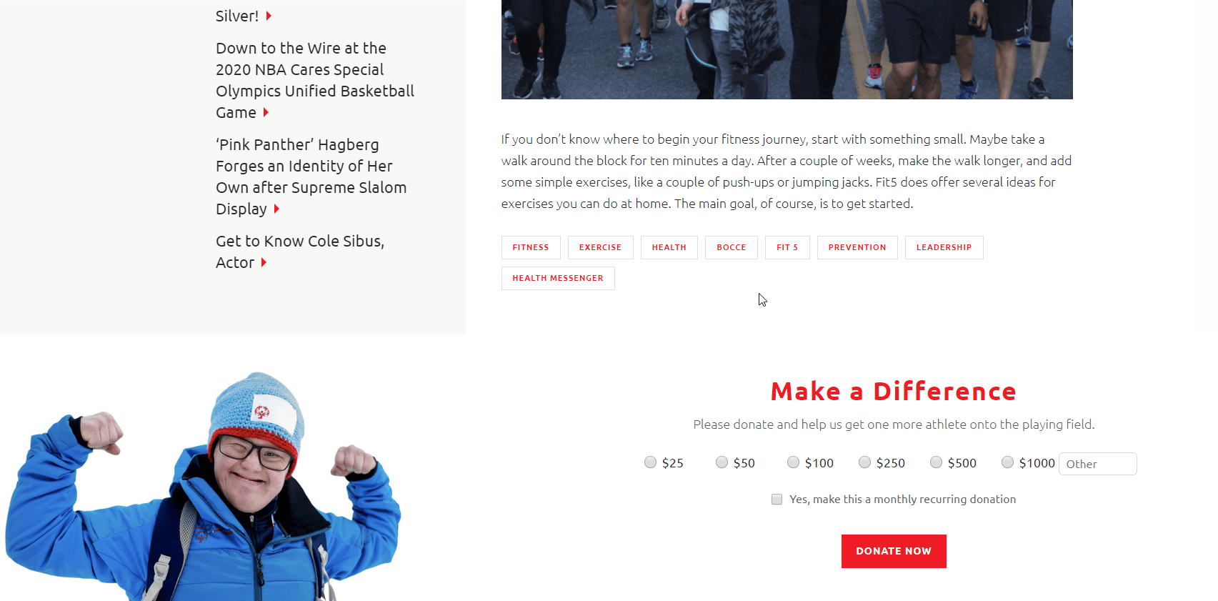
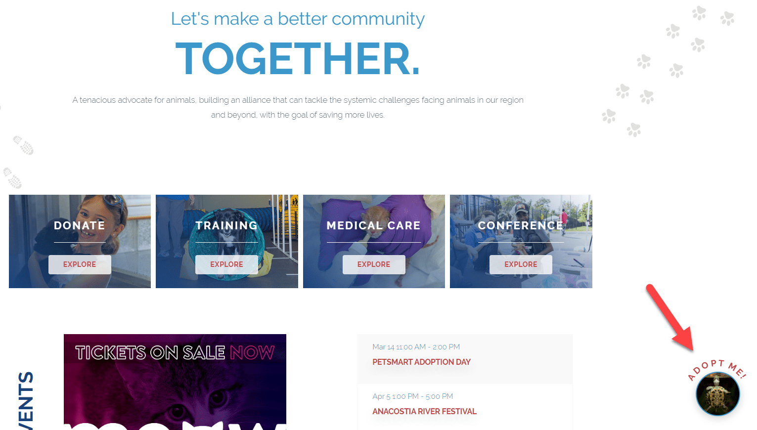
Include donation buttons or forms on crucial pages
It is not enough to put donate buttons on the home page of your website. They should also be present on other pages of the website.
- Include options to donate on all the key pages of your website (either with a button that goes to the donation page or including the donation form in those pages).
- Show personalized calls to action according to the page you are on. For example, on a page where you talk about X initiative, the button and the title of the donation form could say “help us with X”.
- Include big buttons (a text link or a button that is too discreet can go unnoticed by many users) and repeat them several times on long pages.
Each website is different, but some pages where it may make sense to include donation buttons or forms are:
Pages explaining specific initiatives. Examples:
- UNHCR shows a donation button at the beginning of these pages and a donation form at the end.
- Conservation Science displays a donation form at the end of its solutions pages.
- Special Olympics includes the donation form at the end of each article where they explain how they have helped a specific person.
Pages explaining social impact. Examples:
- Malaria No More shows a large donation button at the bottom of the page where it explains in detail the impact of the organization
- NeverThirst shows a donation button at the beginning and end of the page where they give data of its impact and link to pages of specific stories (which also show the same donation buttons).
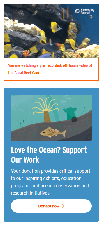
Informative pages or articles. Examples:
- Monterey Aquarium includes a donation button below their live webcams (first you see the animals live, you “connect” with them and there is a higher chance that you end up donating).
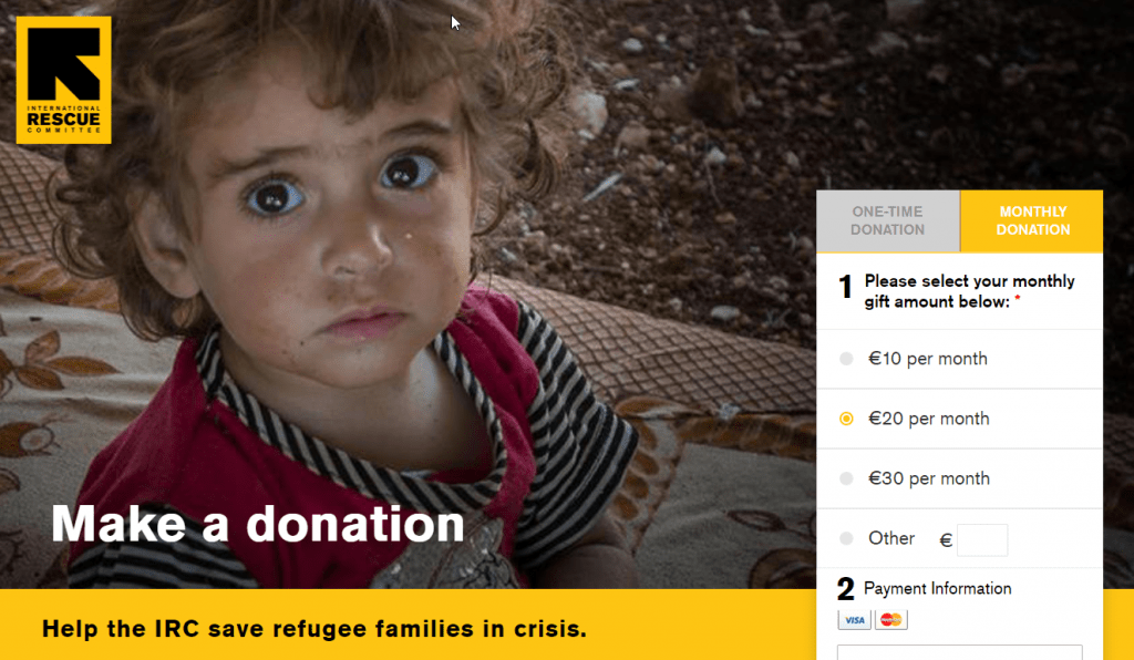
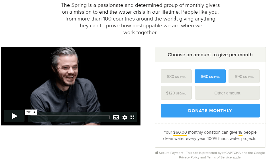
Include powerful images on the donation page
Donating is an emotional act for most people. And we connect emotionally much more when we see an image (or a video) than reading a text.
Therefore, using images that connect with potential donors can make a big difference in donations received.
ASPCA shows several images of animals both on their homepage and on their donations page. They use a slider that automatically alternates images.

IRC shows a picture of a child who looks directly at the camera (eye contact generates more emotional connection).
WYSE shows several pictures of the women that the organization has helped.
Advanced tips:
- If your website has a lot of visitors and donations, we recommend performing A/B tests with different images or videos to see which one generates more donations. It is not easy to guess what will connect better with each audience (positive vs. sad images, 1 static image vs. slider with several images, image vs. video, short video vs. long video…).
- You could even customize the images for each user (if the user arrives at the donation form from a page about helping dogs show a dog’s picture; if it comes from a page about cats change to cat image…). This customization is more complex to implement, although there are web customization tools with free plans such as Google Optimize.
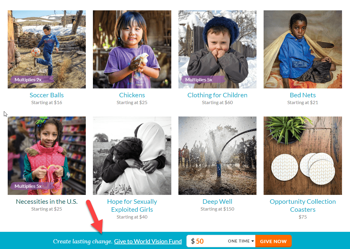
Include powerful data on the donation page
A large percentage part of donors wants to know how their donation will help the organization or problem in question.
Studies have proved that most people experience happiness when they donate money to a cause they believe in (even more than when they spend money to buy things for themselves). And that happiness increases if they see the positive impact of their donation.
Therefore, informing donors of their impact can make donors happier, which can lead them to decide to increase the frequency and quantity of their donations.
There are different types of data and we can show it in different ways:
Give statistics of the problem:
350.org gives data from scientific studies to raise awareness of the problem they address.

St. Baldrick’s highlights chilling statistics on its homepage (every 2 minutes a child is diagnosed with cancer).

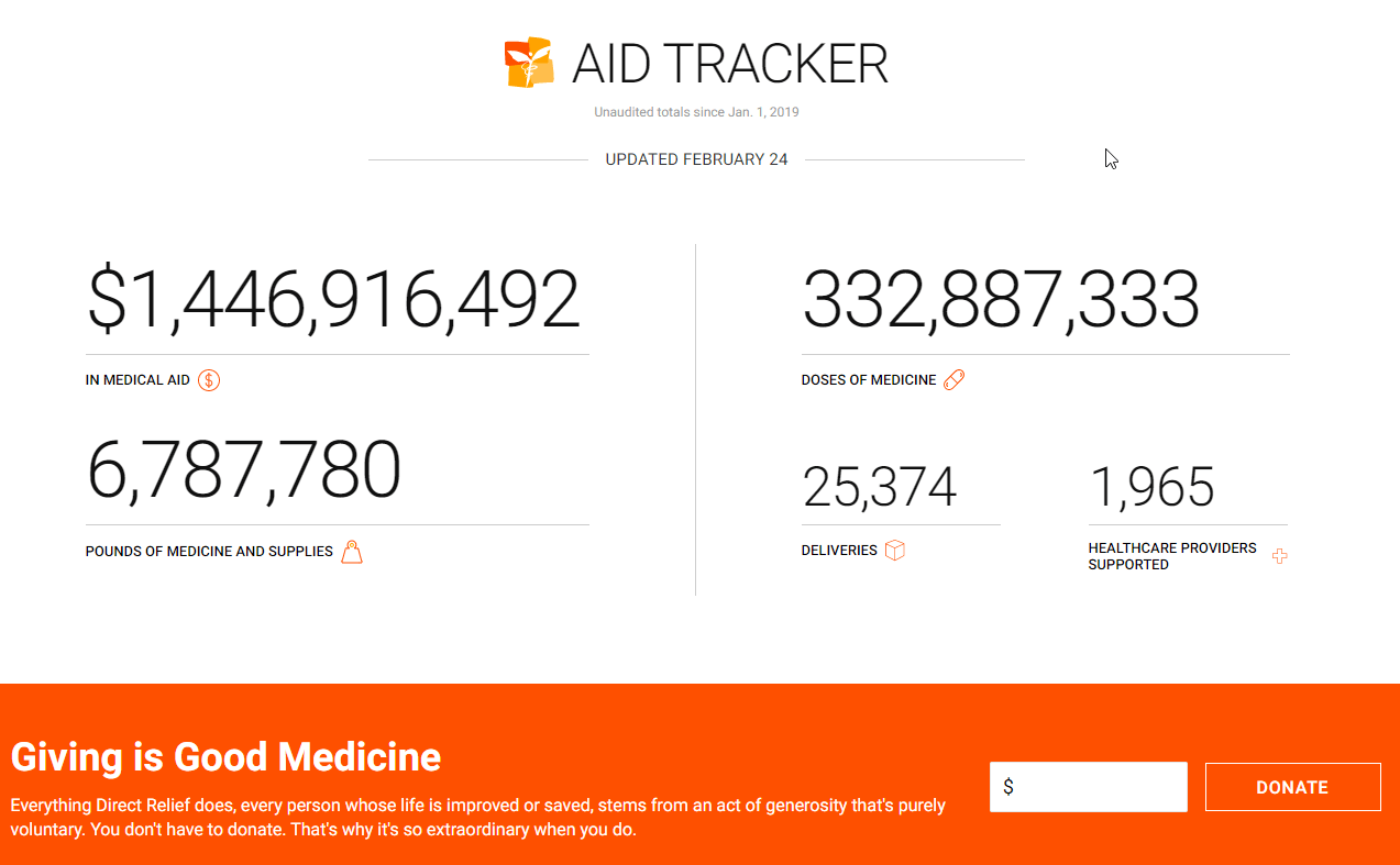
Give statistics of the organization:
Direct Relief shows on its homepage statistics (updated daily) of their tangible impact (millions of $ in aid, doses of medicines sent…) and right after they present the donate form.
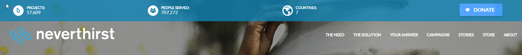
Neverthirst shows data of its impact on the top menu.
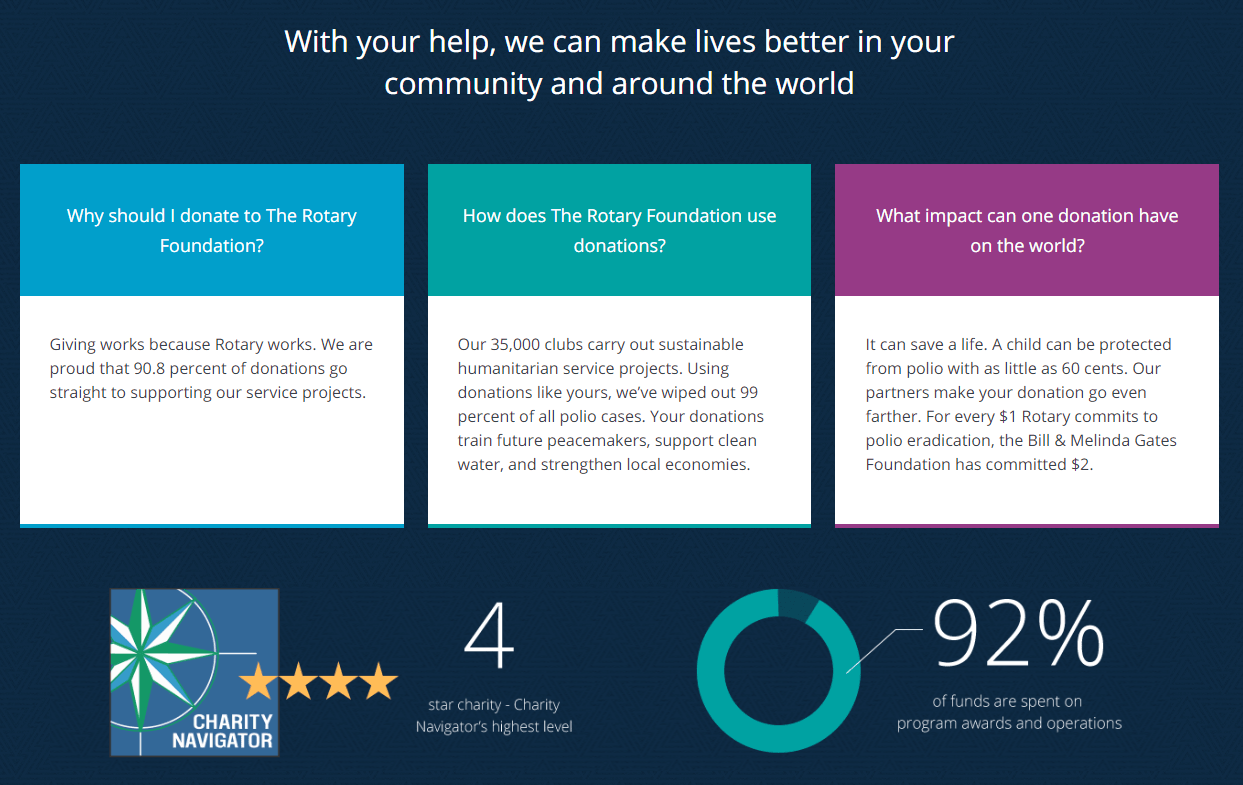
Rotary International shows a summary of the goals and achievements of the organization before and after requesting the donation, instead of just showing the donation form.
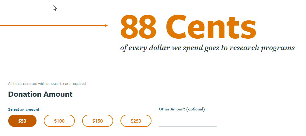
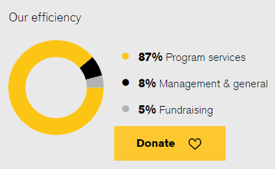
The Michael J. Fox Foundation notes that 88% of the donation goes directly to research programs.
Give specific data of each donation:
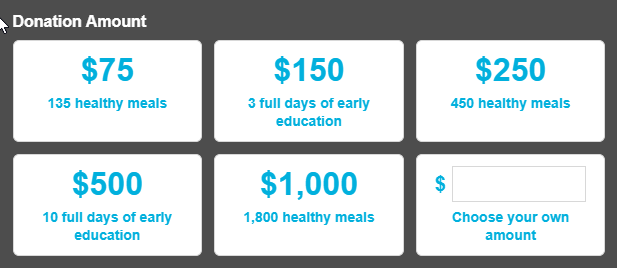
Neverthirst shows on its home page the tangible impact that donations of specific amounts can get.
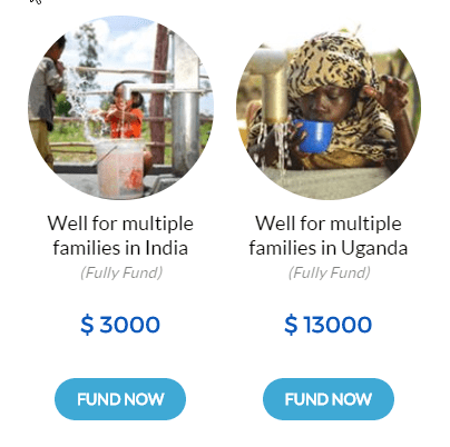
Code for America gives data on the specific impact that certain donation amounts have. In Martha’s Table they even include this information in the amount selector to be donated.
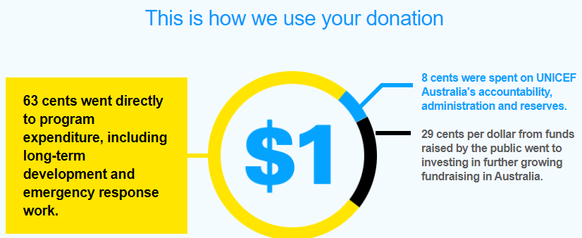
Unicef shows a graph that indicates precisely how they use each dollar they receive.
IRC shows that at the bottom of all the pages of its Web:
Mix all of the above:
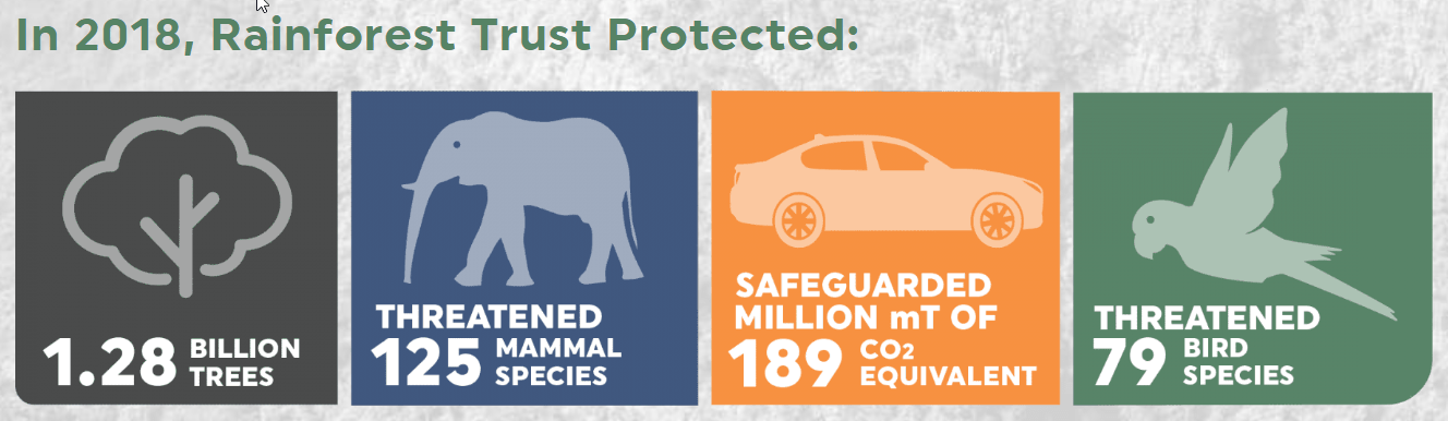
Rainforest Trust is displaying several data throughout its home page:
- Total impact since they were founded
- Impact in the last year
- Problem statistics (every minute, 50 acres of jungle are lost)
- Solution statistics (we save 1 acre every 16 seconds)
- Income and expenses of the organization
IMPORTANT: Keep in mind that some studies have indicated that showing statistics and efficiency figures are not always the best way to increase donations. Therefore, we recommend testing (if possible with A/B tests) what approach works better for your organization: Data-based, emotion-based or a mix of both.
Include data to gain donors trust
The donor must trust that your organization is reliable and that their donation will be well used.
We can use different elements to strengthen the image of trust, such as:
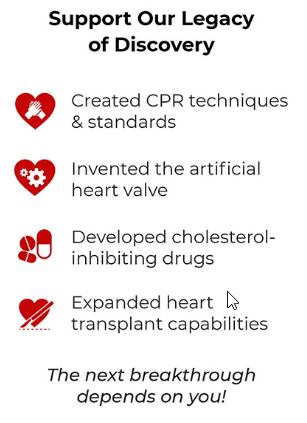
Give concrete data of what the organization has achieved during its history and in the last year, as they do in the American Heart Association
Show accreditations or awards, as they do in 4H and UCS.

Show media appearances, as they do in World Housing.

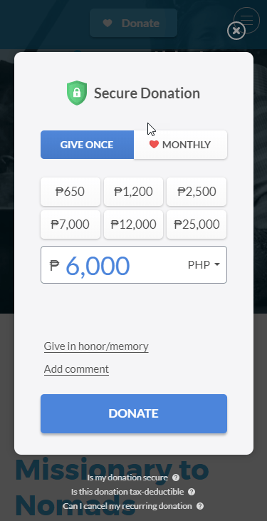
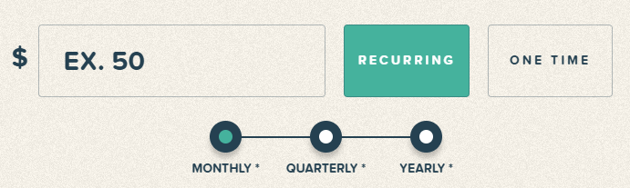
Enhance recurring donations
Recurring donors are usually much more valuable than one-time donors, not only because they end up donating more in total, but also because they give a “fixed income” that increases the organization’s stability.
Options to get more recurring donations:
Highlight the monthly donation option and explain why it is the best option to help the organization, as they do in ACLU:
Or even more striking as they do in UCS:

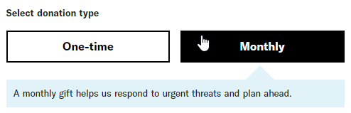
Show the recurring donation selected by default (and perhaps allow donors to change the period if they don’t want monthly). E.g., Upstream
Promote a community of committed individuals that donate monthly. And perhaps create exclusive elements for these donors (newsletter, online group, etc.). E.g., Charity: water
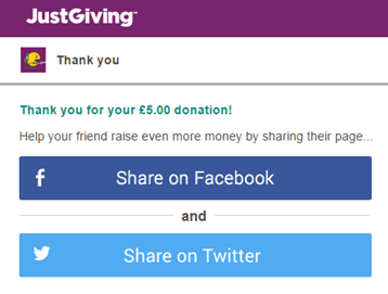
Optimize the donation confirmation page
Don’t forget what happens right after receiving the donation from the user.
They will be motivated and happy to have made their contribution, so apart from thanking them for their help, it can be interesting to ask them something else:
- invite their friends to collaborate
- follow you on social networks
- join as volunteers
- organize an event to raise funds
For example, JustGiving achieved a significant improvement (which for them resulted in an extra 1.5 million dollars a year) just by trying different formats for their social media sharing buttons.
RECOMMENDED
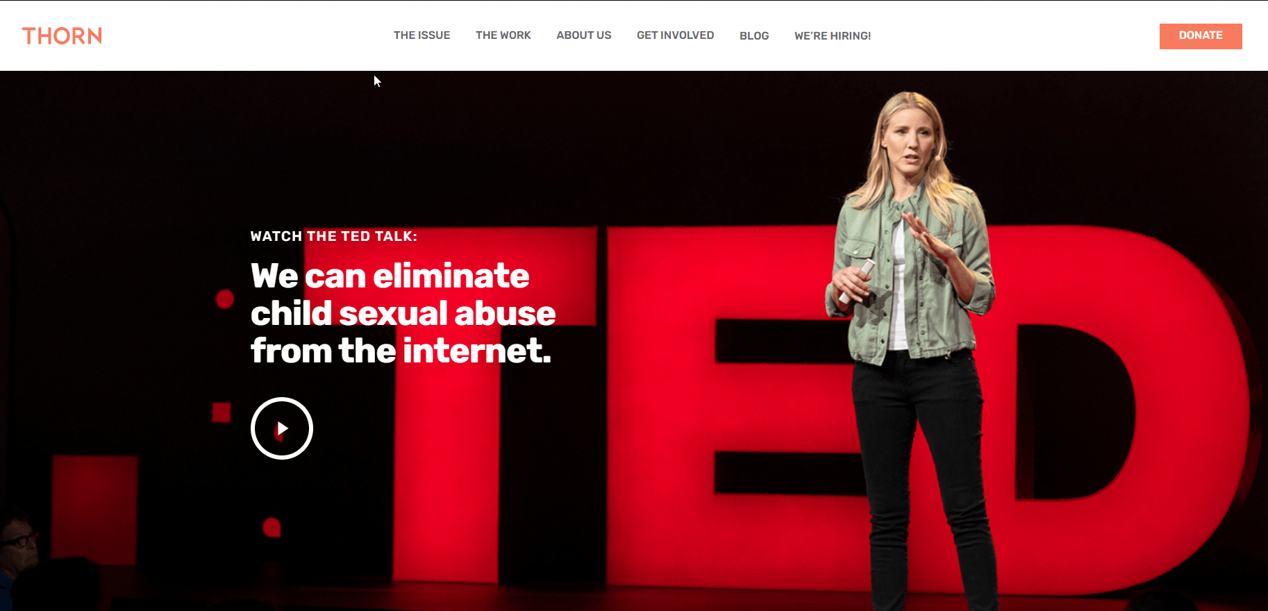
Present your organization first
You should ask yourself a question: Do most people who come to our website already know our organization, or do we have to explain what our cause is and who we are before asking them anything?
If your organization is not famous, you should probably explain some details about your organization before asking for a donation. Without that, no matter how much you have optimized the donation pages, you will not be able to convince many users to donate.
It’s usually better to show the information in a visually appealing way (using images, icons, different sections…) instead of big blocks of text that “overwhelms” potential donors (most don’t want to read a lot). E.g., Thorn and The Pad Project.

Another option is to show a presentation video as the main thing in your homepage, as they do in Thorn.
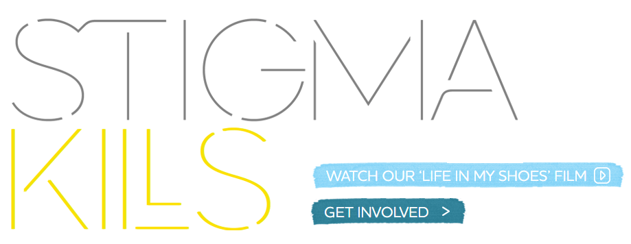
Or even entire documentaries as they do in Life in my shoes.
Give more contact options for questions and donations
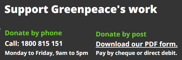
Offer the option to donate by phone, as they do in Greenpeace.
Offer the option to contact by phone or email for questions and donations, as they do in 4H.

Donation button always visible
The more visible the donation button, the more likely it is that potential donors will decide to take the step.
You can put a donation button on the top menu of the Web and configure it to remain while scrolling on the page (it’s called a “sticky menu”). E.g., Room to Read.
Show several donation buttons on the home page
The home page of a website is usually the most visited one, so it is vital to guide users and align it with the organization’s goals.
If the main goal is to get more donations, we recommend that the home page contains several donation buttons (especially if it is a long page, in which users can get “lost”).
- Greenpeace uses several buttons to donate and even a donation form on their home page.
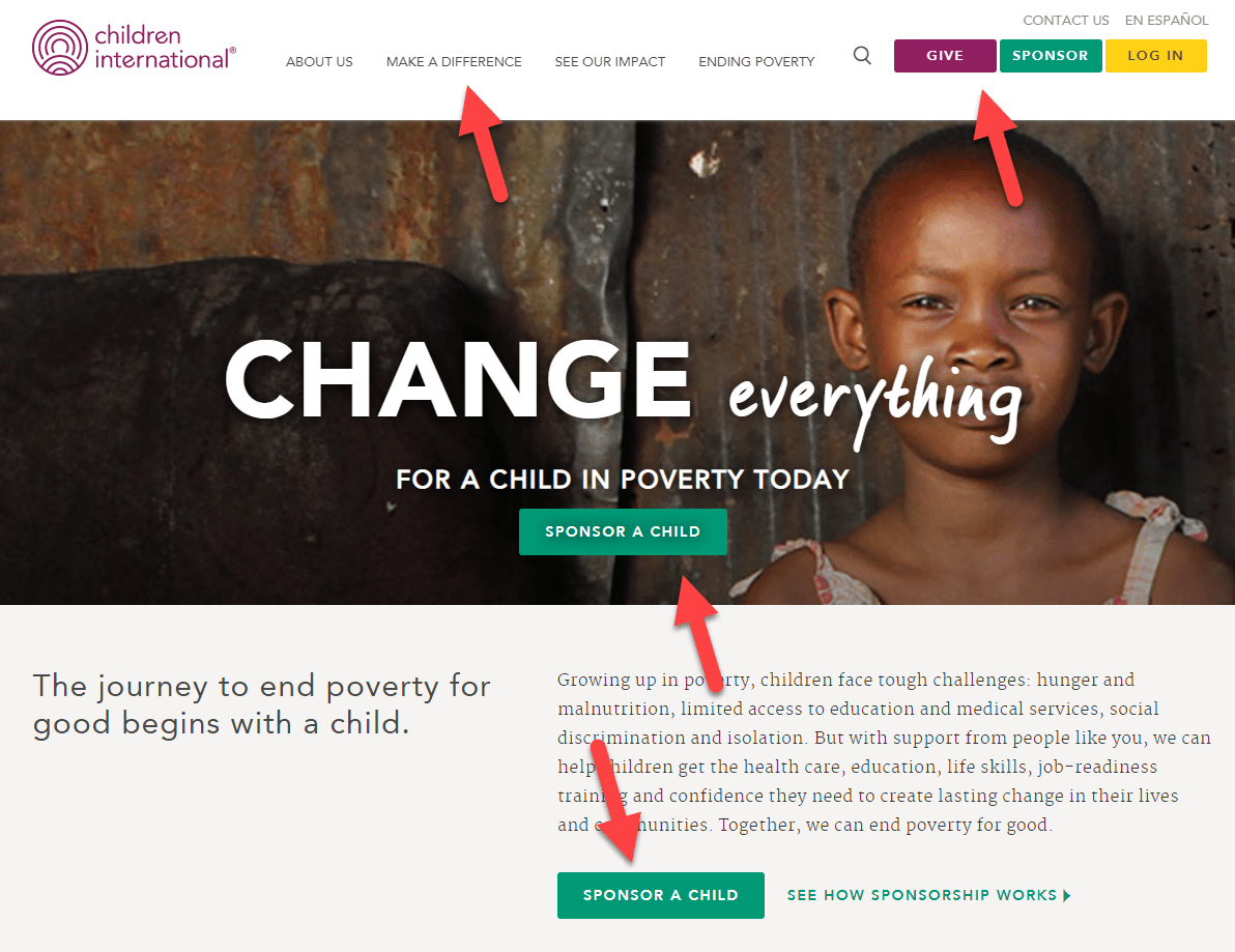
- Children International shows 4 different buttons that lead to their donation page and other links that lead directly or indirectly there.
Ask donors for opinions/suggestions
You can take advantage of the donation form to learn more about your donors. For example, you can ask them where they want to “invest” their donation money. You can give them options or put an open comment field as they do in Upstream:
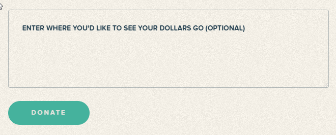
Asking this can provide valuable information to the organization about donor priorities and at the same time increase donor satisfaction because it shows that the organization values their opinions; they are not just a source of money.
Remove distractions on the donations page
Once the potential donor has reached the donation page, we do not want anything to distract them from the primary goal (complete the donation process).
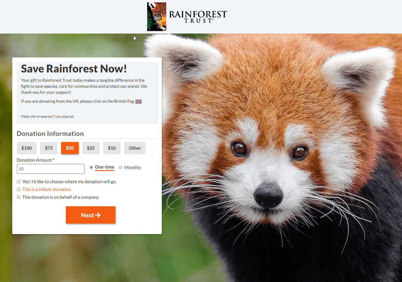
Therefore, you can increase donations if you remove items that may distract the user. E.g., Rainforest Trust removes the top menu and shows a very simplified footer.
Respect your organization’s branding on the donation page
Many nonprofits create their donation pages with an external tool. And some tools don’t offer many customization options, so they their donation pages end up looking very different from the rest of the website.
The potential donor can notice this and it may decrease their trust on that page/organization, which can cause donations to be lost.
We recommend maintaining the same design on the donation page (logo, colors, button style, etc.)
E.g., Alliance for Youth Action shows the entire donation form in the same colors and style that characterize the organization’s brand.

Show answers to frequently asked questions (FAQ)
If your potential donors usually have certain doubts or objections before donating, it’s better to solve them on the donation page itself.
Solving their common questions in a FAQ may increase the donations received and also reduce the time/cost of dedicated staff to answer these recurring questions over and over again.
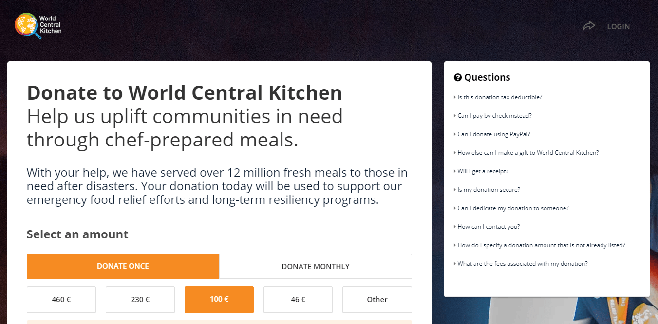
E.g., World Central Kitchen shows their FAQ on one side (shown at the end on mobile devices)
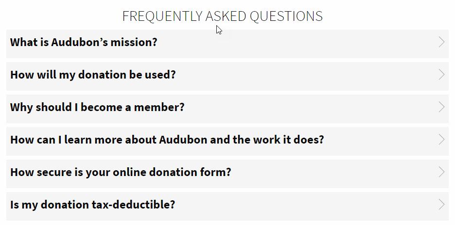
E.g., Audubon shows their FAQ at the end of the donations page.
OTHER IDEAS OF IMPROVEMENT
Test different texts/approaches
There are different donor profiles, with very different motivations. It is convenient to study the characteristics of your audience and adapt the messages accordingly.
If you have a large volume of users, you can do A/B tests with different messages and check which type works best.
- Some donors are motivated by objective data (they value knowing exactly how their money will solve the problem)
- Others are more emotional (based their decision on values and personal stories they want to support)
- Others donate for tangible benefits on a personal level (tax deductions, reputation, contacts, social pressure…)
1-page donation page vs. several pages/steps
Donation forms are usually divided into several pages, so the user is not “overwhelmed” by a huge form. But this is not always what works best. Showing everything on one page can make the process faster and more transparent.
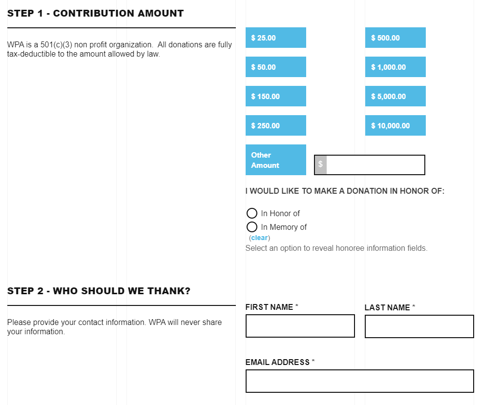
E.g., WPA shows the complete form on 1 page, divided into different sections/steps:
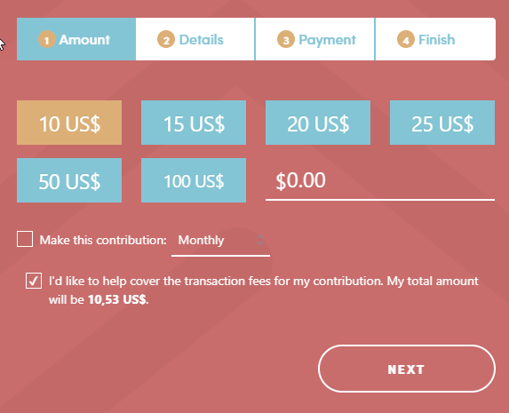
E.g., Healthier Colorado divides it into several pages and indicates that there are 4 steps, so the user knows what to expect. They use javascript so that the page does not load again at each step, which makes the process more fluid and faster:
Capture emails before asking for a donation
Organizations usually highlight the donate buttons and not the collection of emails from potential donors.
This strategy can be a mistake because many donors will not be ready to donate on their first visit to the Web. But with proper “warm-up” (welcome emails presenting the organization, monthly newsletters explaining actions and programs, etc.), a lot of them can end up donating at some point.
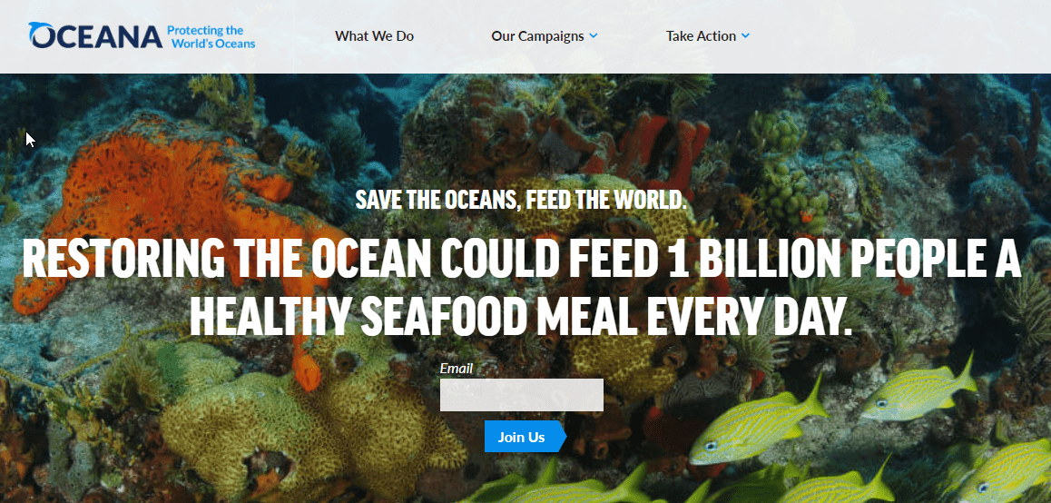
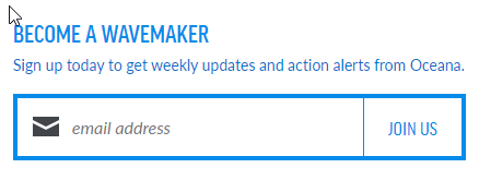
Oceana applies this concept, where instead of asking for donations directly, they invite you first to leave your email and join their cause.
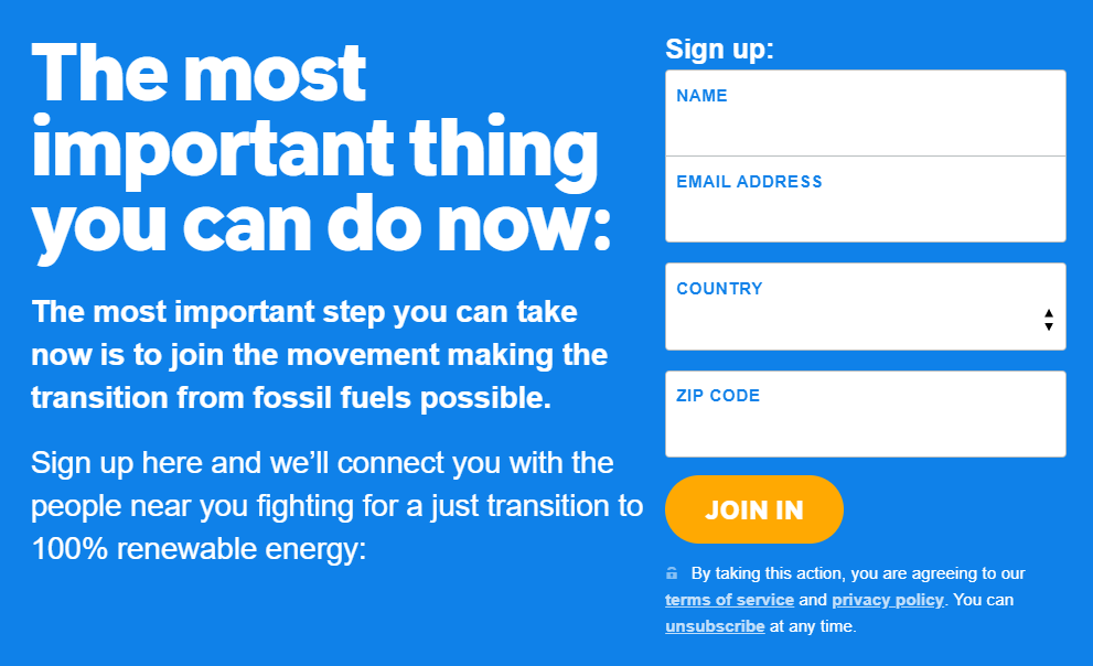
350 invites to join their movement and connect with other people concerned about the same issues.
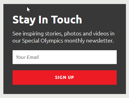
Some organizations are highlighting other options to inform and help. For example, in Special Olympics, they give visibility to their monthly newsletter with new inspiring stories. They also give you the opportunity of sharing your personal stories related to your mission.
To get the best results and get more emails, we advise trying different texts/formats to see which one is the most effective. Usually, it works better to invite them to join your movement (for example, Oceana with its “Become a Wavemaker“) than simply asking to sign up for your newsletter (most people already consider that they receive too many emails).
Incite a feeling of guilt
This is a more controversial strategy, but one that many NGOs have used successfully for decades. Depending on the audience of your NGO, it can increase donations or drive away even frequent donors.
We recommend using this tactic with great caution, without being very aggressive and performing an A/B tests with different approaches if possible.
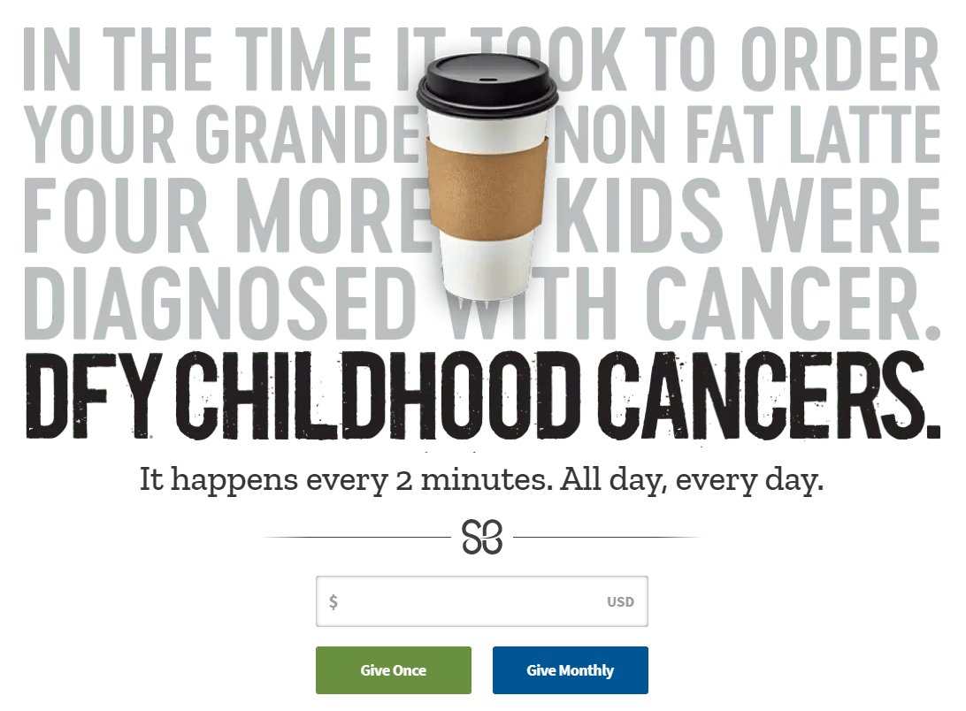
E.g., St. Baldrick’s shows that while you are ordering your coffee, cases of children diagnosed with cancer continue to arise. It is implied that perhaps you should dedicate part of your money to their cause, instead of spending it on expensive coffees.
Try more or less text
If you have enough traffic and donations, you should do A/B tests trying to show very little text in the donation page (maybe just a compelling title and donation form) against options with more text (to explain in detail your organization’s “story” and motivate those who still have doubts).
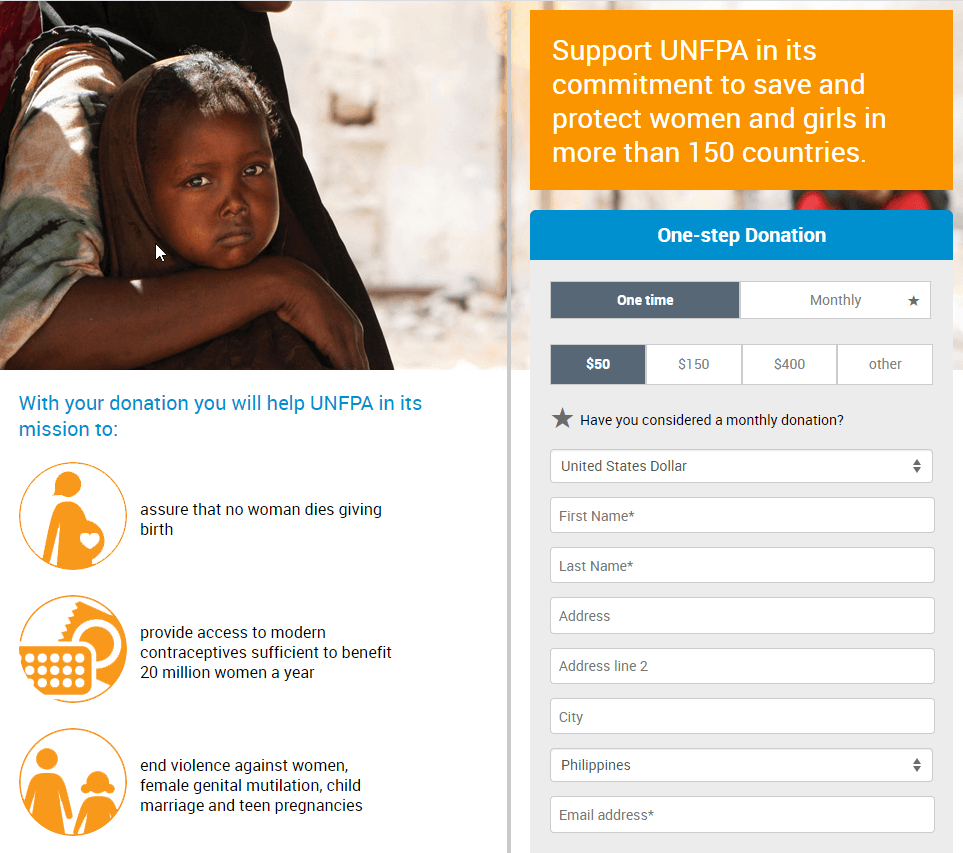
Maybe also try something intermediate (short texts supported by icons and images), as they do in UNFPA.
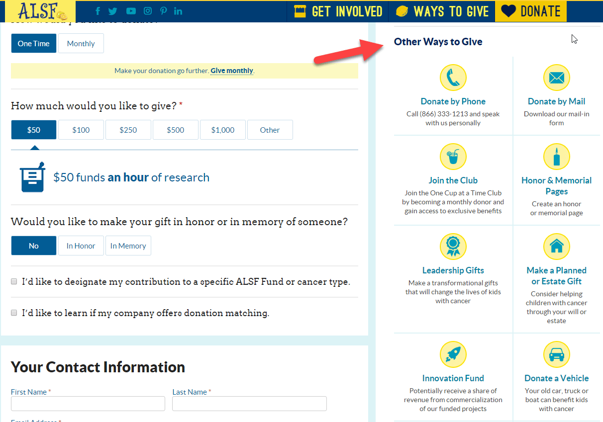
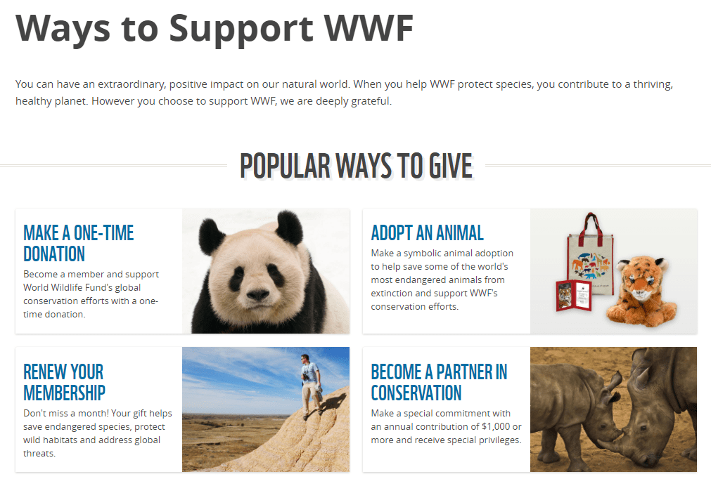
Show other options to collaborate (or not)
You can also test whether to put an intermediate step before the online donation form, with a page explaining the different options to help (instead of the donation form directly), improves or worsens the results.
Sometimes you lose people if you put more intermediate steps in a process. But by showing other options to help, you may be able to enhance other objectives (more volunteers, more fundraising campaigns…) without significantly decreasing online donations.
Test urgency
If we communicate potential donors that it is urgent to receive his donation to achieve important objectives, they are more likely to decide to make his donation and even donate more money.
For example, international organizations such as Doctors Without Borders launch special campaigns to collect donations when there is a natural disaster or a timely emergency.
It is important not to abuse this technique and not convey urgency if it is not real, because transparency and sincerity is key to maintaining the reputation of your organization.
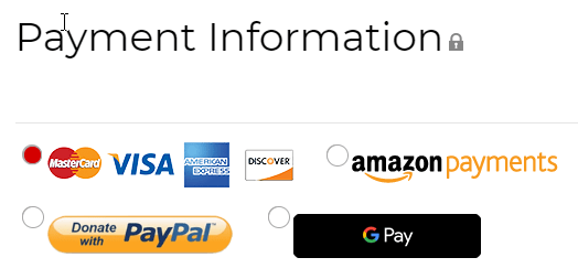
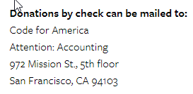
Offer more payment options
By giving more options, you can get more donations and/or reduce commissions (if more people opt for payment methods without commission for the organization).
E.g., Thorn gives the option to donate with Paypal, Facebook and Bitbay (Bitcoin).

E.g., American Heart Association offers card payment, Paypal, Amazon Payments and Google Pay.
E.g., Code for America stress the option to donate by check or bank transfer to avoid commissions, so the 100% of the donation reaches the organization.
Show forms instead of donate buttons
For example, Oceana shows on its home page 2 different forms where donors can select the amount they want to donate (instead of only showing a donation button and selecting the amount in the next step).
In NeverThirst, they show donate buttons, but the form opens in a popup window (it does not redirect to another page). This may be better because you don’t have to wait for another page to load, but it gives less space to provide complementary information.
Show the most recent donations
Humans are social beings and we are influenced by what other people do.
Therefore, you could increase donations by showing data of recent donations or highlight famous people or institutions that have supported the cause.
E.g. In Martha’s Table they show a list of the last donors, with their full names.
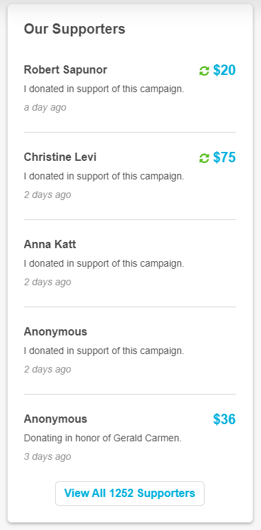
Another option is to use Fomo style tools to display small “notifications” on the Web with information on recently received donations. These notifications give a sense of activity and ideally show that many people are donating. This tactic has been used for years by companies such as Booking.com
Show exit popups
Exit popups are windows that appear automatically when the system detects that the user may be leaving your website (usually because he moves the mouse to the top of the browser).
It’s a “last chance” to connect with the user.
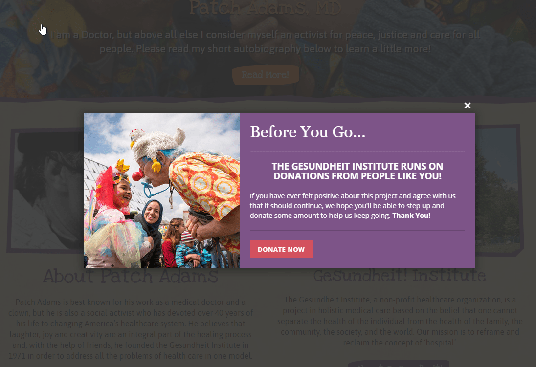
We can use an exit popup to ask for donations as they do in the Gesundheit Institute.
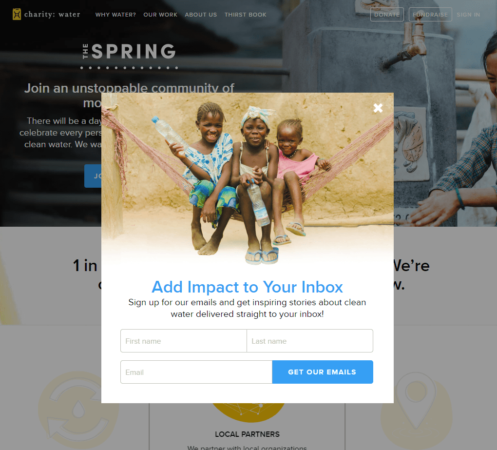
Or ask for their email (to connect with them long-term and try to increase donations), as they do in Charity: Water.
Show initial popups
Another option (more aggressive) is to show a popup as soon as the user enter your website (or after a few seconds).
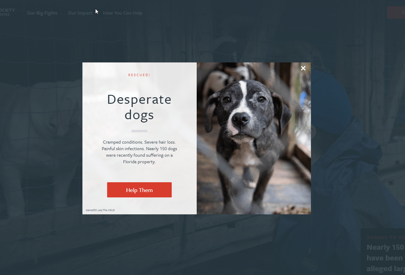
E.g. Humane Society shows an emotional photo and button to donate as soon as you reach their website.
Doctors Without Borders is even more direct, showing directly different amounts to donate.
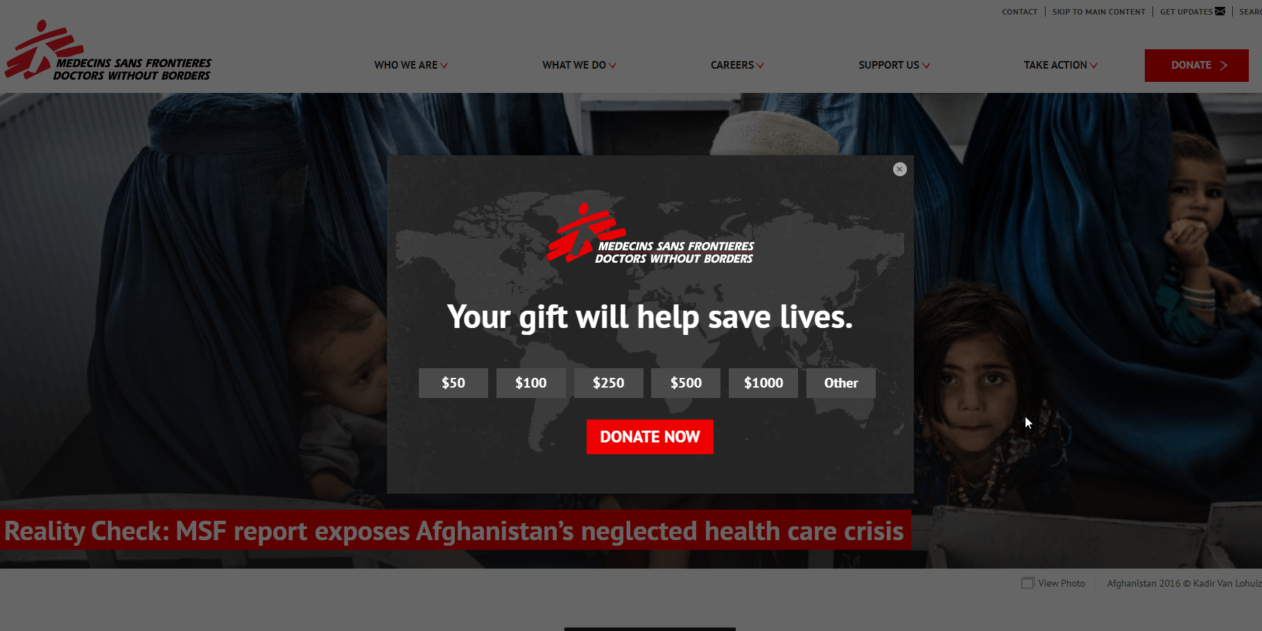
It may increase donations in some cases, although it can also have negative effects. You are interrupting the user navigation with a popup; some people will find it annoying or too aggressive and that could have an impact on their future actions/donations.
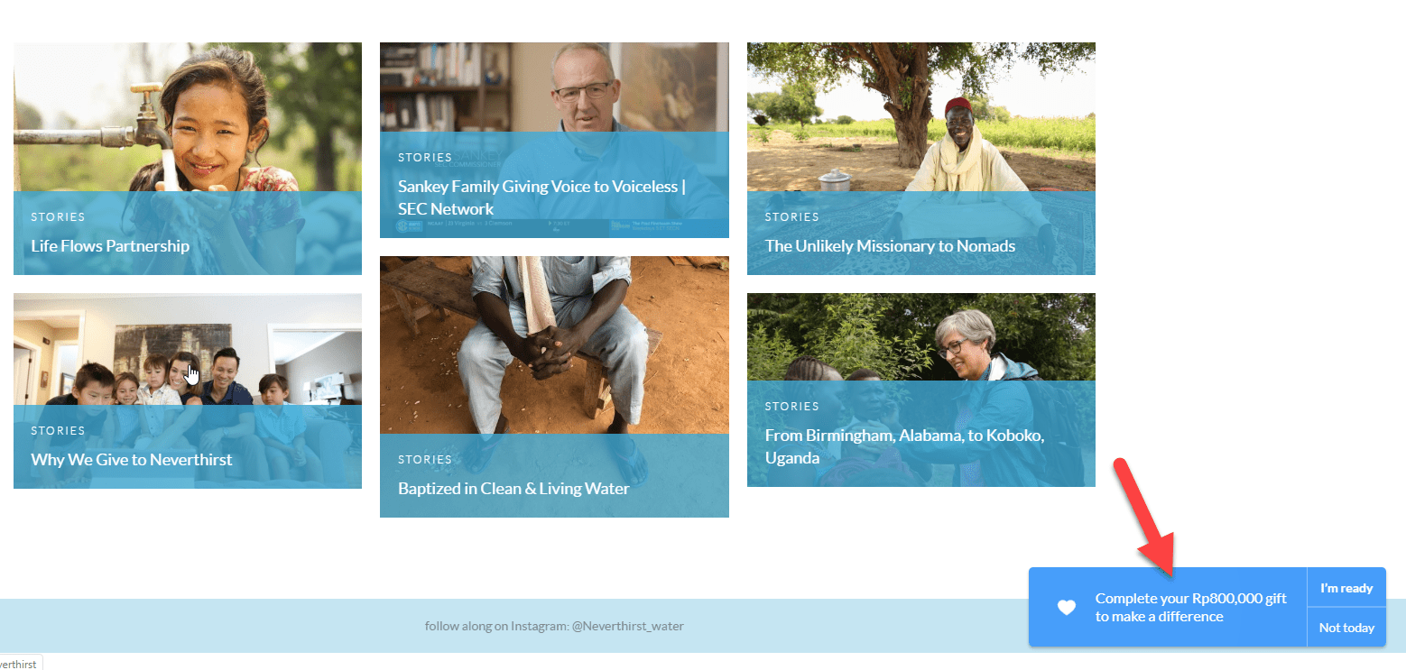
Show donation widgets
Popups are effective because they attract a lot of attention, but also annoying because they interrupt user navigation.
A less aggressive alternative is to show some kind of widget that does not interrupt navigation, as they do in the Humane Rescue Alliance with a circle of “ADOPT ME!” in the lower right of all their website.
Worldvision shows a bar to collect donations.
Neverthirst does something more sophisticated: If you start but don’t complete the donation process, they show you a reminder to complete it. This is more complex to implement at a technical level, but it is quite interesting if your donation process has a high dropout rate. They use a donation tool that offers this feature (FundraiseUp)
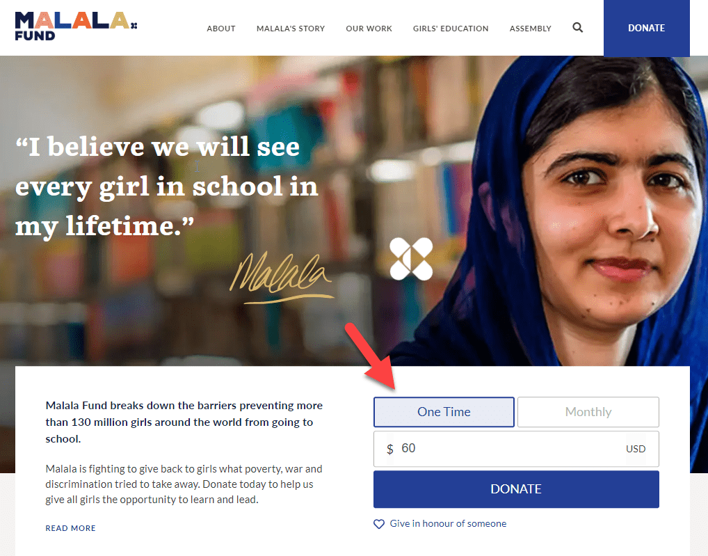
Put a donation form on the home page
Instead of sending users to a specific page with the donation form, you may achieve better results if the form is put directly on the home page (or at least the first step of the donation form, if it has several steps).
E.g. In malala.org is almost the first thing you see. This may work well if your nonprofit is well known and visitors come in ready to donate.
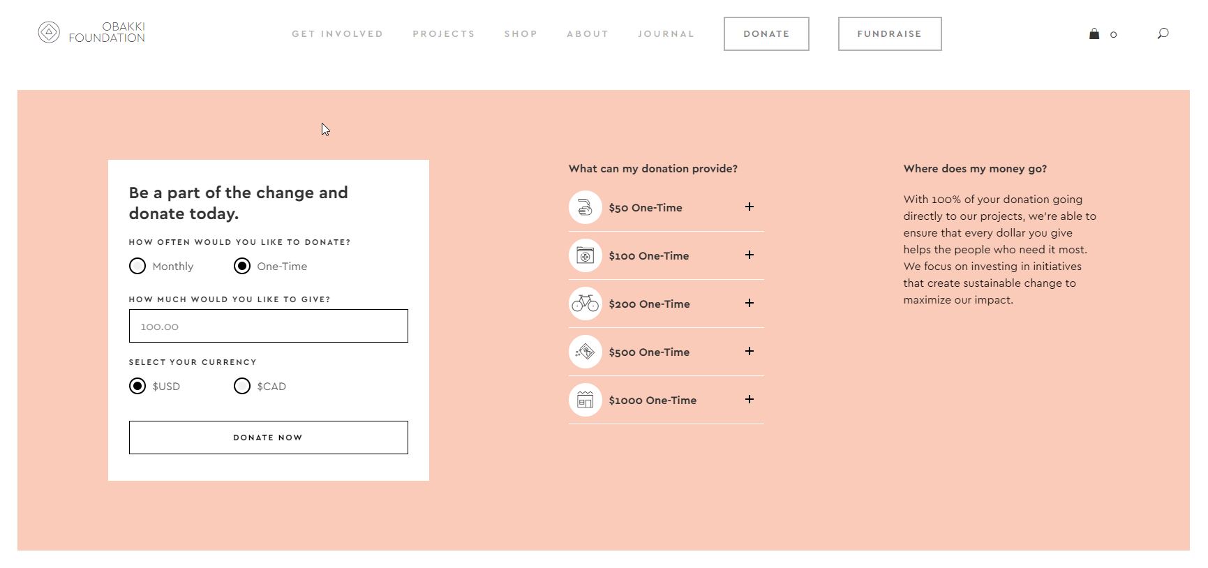
E.g. In Obakki Foundation, they put the donation form on the home page but at the end, after presenting properly their organization.
Try with different buttons
You can try different designs and texts on the buttons that lead to the donation page or on the buttons of the donation page itself.
By making the button design stand out more (large button and with bold colors) you can get more clicks and donations.
Regarding textm, instead of something like “donate now” you can try alternatives such as:
- Change the world
- Collaborate with us
- Help with X (the main objective of your organization)
- Send us your help
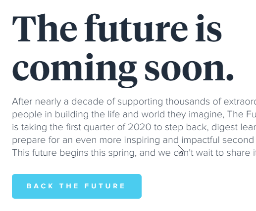
E.g. The Future Project uses “Back the future”.
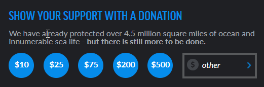
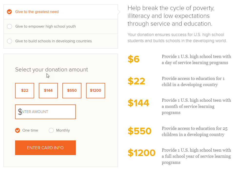
Try different default amounts of donations
Simply showing different amounts on the form can increase the average donation.
You can also try changing the quantity that is selected/recommended by default and removing the default quantities.
You can study what is currently the average donation to your organization. If you consider it to be too low, you should add to the donations form a couple of options/amounts that are above the average and maybe also raise the minimum option (for example, if the average is $100 and the minimum $25 you could try to show as options: $50, $100, $150 and $250).
Also, if your donation system allows it, show different amounts depending on whether you choose a specific or recurring donation (one-time donations tend to be larger than recurring donations).
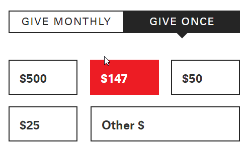
Another option is to show the highest quantities first and show a high amount as the default, as they do in World Bicycle Relief.
The most reliable way to measure the effect of these changes is with A/B testing, but depending on how your donation system works, it can be difficult to configure this kind of tests.
The other option is to do a test “manually” . For example, trying for 3 months different amounts (changing to a new one every month) and evaluating if there is a clear pattern or a combination that makes the average donations increase clearly. It will not be as reliable as an A/B test, because there may be other factors that influence (other website changes, new promotional campaigns, seasonal factors…). So if you do it this way, it is important to check later that the winner option really increases donations in the long-term.
It is also important not to do the tests in December, because usually nonprofits receive more donations and for a higher value in that month, so the conclusions could not apply to the rest of the year.
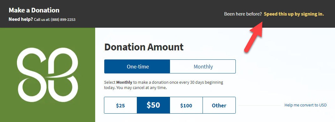
Offer user accounts
If you allow users to register on your website, they can make future donations quicker (as they do it in Amazon for example, where you buy with just 1 click because they already have all your data).
Besides, you can offer them more services as registered users (check previous donations, download certificates, access to an online donor community…)
E.g. The St. Baldricks Foundation highlights the option to login/register your account to donate faster.
Use website personalization tools
Showing the same content to 100% of your website visitors is usually not the best option. There are different segments of visitors with different interests and you could get better results if you customize the contents of your website for those different segments.
There are many customization possibilities, such as:
- Differentiate first-time visitors from frequent visitors. For new visitors we can focus on presenting the organization, while for frequent visitors we could focus more on asking for donations, informing them of new initiatives, etc.
- Show different content to users who visit us from different countries (For example: Explain what we are doing in their specific country, change the language of the page, change the donation forms to show their local currency, etc.)
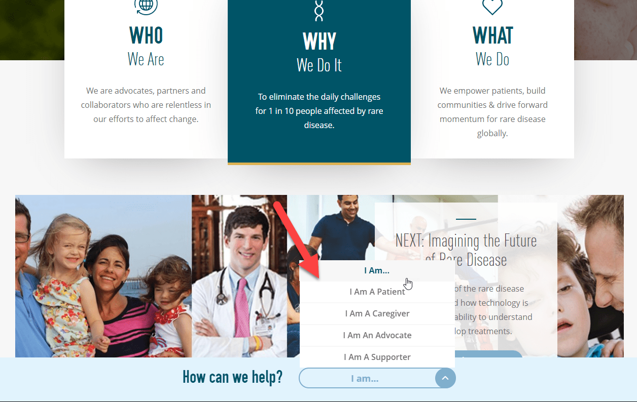
- Let the users themselves select which segment they are in and provide them with personalized information based on it. They do this in Alley Cat Allies with their “GET INFORMATION TAILORED TO YOU” block and in Global Genes with their bottom bar “How can we help?”
Some tools for website creation include personalization features (for example, WordPress has several plugins that allow some easy customizations). Apart from that, there are external tools for web personalization, like Google Optimize that has a decent free plan and easily integrates with Google Analytics (which makes it easier to measure the results of the customizations).
Try showing other options to help on the donation page
Instead of just displaying the online donation form, you may get more help if you give them other options. There are different ways to present this:
As a side block of the donation form. E.g. Alex’s Lemond Stand Foundation
As a block below the donation form (if they haven’t filled out the form and have continued scrolling down the page, maybe they are not convinced to donate online, but they could be interested in other options to help). E.g. Legacy and Humane Society.

As an intermediate page (that when you click on the donate button does not directly open the online donation form, but shows a page with different options to help). E.g. WWF and Nashville Zoo.
Boost large donations
It may be interesting to create a separate page for large contributions, with specific information or different payment methods.
E.g., Charity: water explains in detail what they can get with a large donation (over $10,000) and how the process works for those donations.
Show specific projects or beneficiaries
Some studies indicate that concrete and solvable problems tend to generate more interest and involvement than more global and difficult problems to solve.
According to another experiment, people who read specific information donated almost twice as much as those who read more general information.
Practical translation: It could be interesting to mention specific data (stories, projects or even specific beneficiaries) on the donation pages, rather than just giving statistics on global problems.
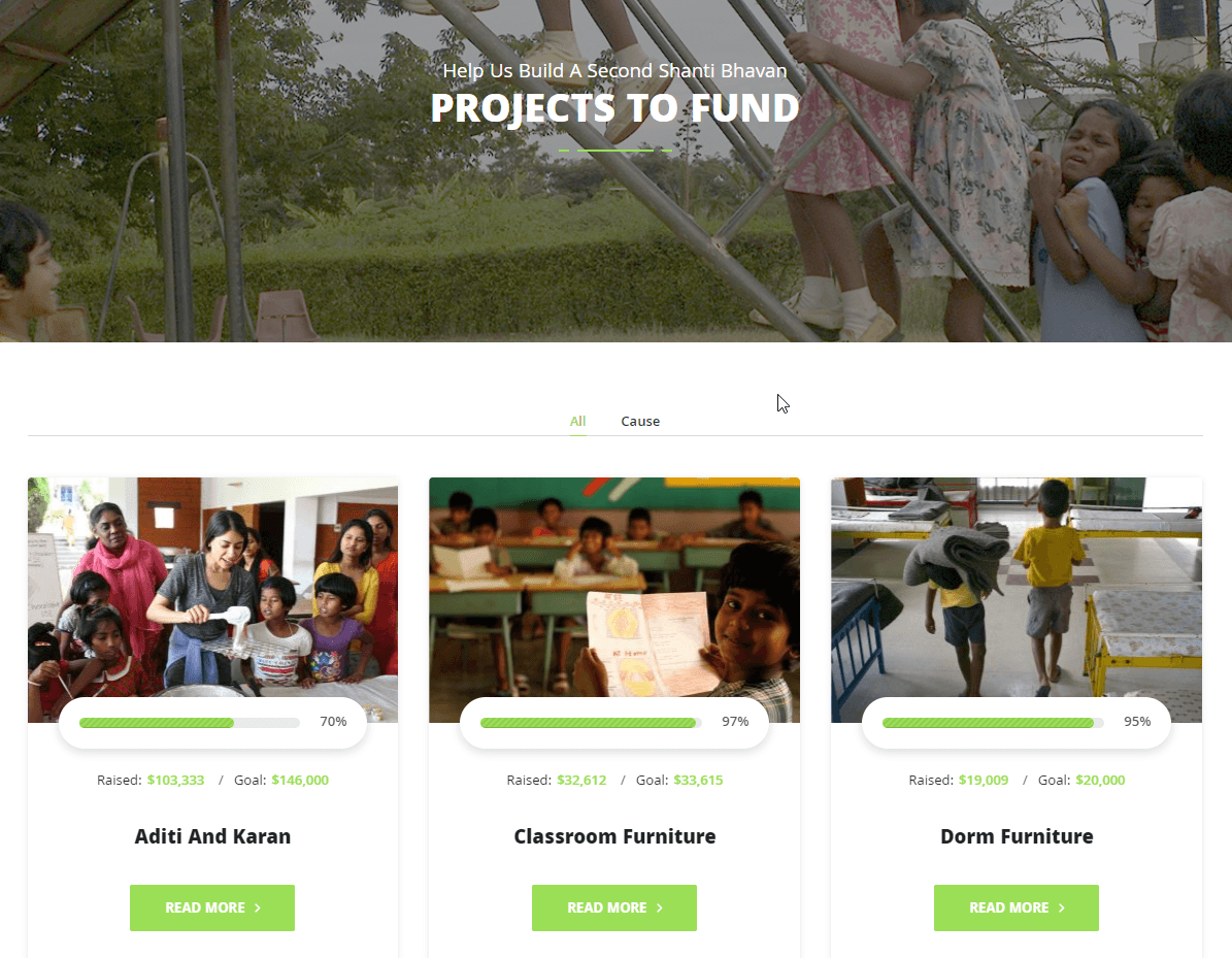
E.g. Children International and Shanti Bhavan allow you to choose which recipients or specific projects you want to fund.
Show the impact of different amounts
You can try showing what your organization will achieve based on the amount the user donates. It’s an option to provide specific impact data but without the donor choosing specific projects or recipients.
E.g., BuildOn allows you to select what type of project you want to donate and on the right side they explain what they will achieve for different amounts donated (customized according to the kind of project you have selected).
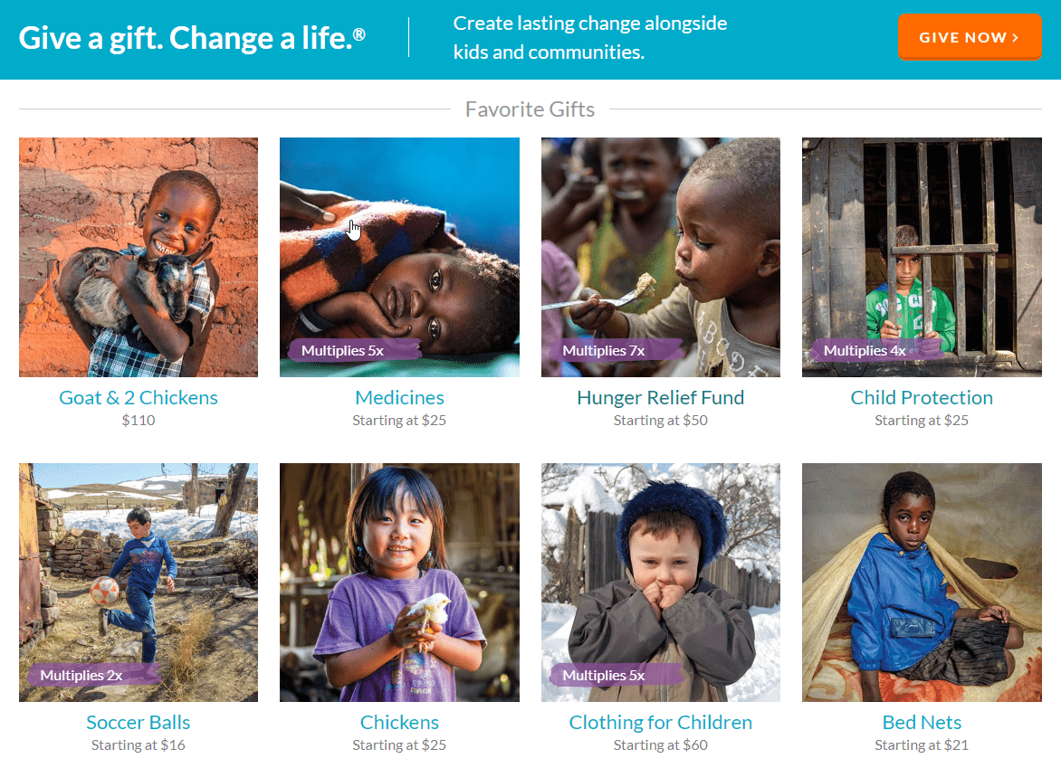
E.g., Worldvision shows different “gifts” that can be given to the beneficiaries, according to the amount you want to donate.
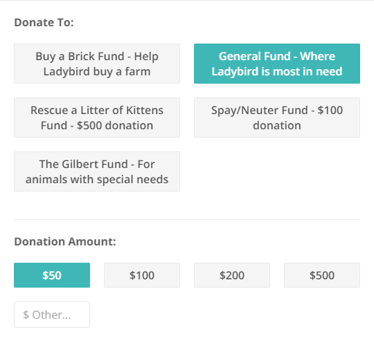
E.g., Ladybird Animal Sanctuary allows you to select what type of action the money is going to go, explaining what they will achieve with the amount you give.
Offer gifts for donation
You can consider giving a small gift to your donors. This has some advantages:
- It can be a form of indirect promotion if you give merchandising with the logo of the organization (it can help more people discover the organization and eventually become donors).
- You can increase donations made by some donor segments (especially if certain “premium” gifts are offered only for high-value donations).
But also some disadvantages and risks:
- Some studies indicate that you can make the potential donor think more about the value of gifts than their altruistic motivation (which can lower the quantity donated).
- Producing and sending those gifts requires time and resources that could be devoted to the main goals of the organization.
Depending on the type of organization and your target audience, it can be an interesting test, with a couple of precautions:
- Always give the option of “I do not want a gift” (for those who prefer that 100% of the donated goes to the cause).
- The gifts should always leave you a healthy margin (they should cost less than 10% of the donation)
- It’s better if the gifts have a “viral potential” (for example, give away shirts with striking designs, that will attract attention of new potential donors when the owners wear them in the street or share a photo in social media with them)
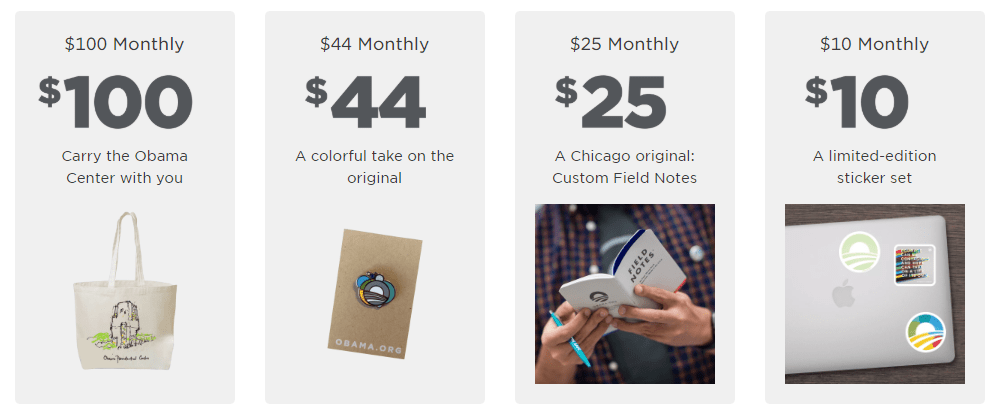
Obama Foundation gives different gifts according to the amount donated:
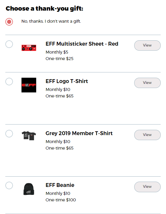
EFF even lets you choose different gifts for the same amount:
Give an honorary title or exclusive benefits depending on the amount donated
Another option is that the gift is not something physical, but some kind of service or special recognition:
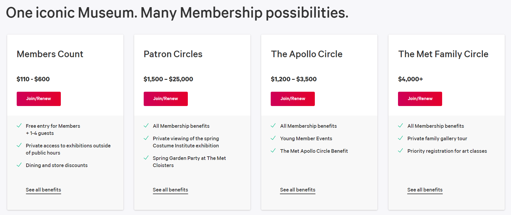
E.g., Met Museum and American Friends of Covent Garden offer different levels of membership with different exclusive benefits (invitation to special events, priority reservations, discounts, etc.).
E.g., Shanti Bavhan offers to put your name to different facilities, depending on the amount donated.

Let me finish with some recommendations of useful resources for nonprofits:
- Free Google Ad Grants audit: Discover errors and opportunities
- Google Ad Grants checklist: Steps to follow to achieve good results
- Newsletter: Discover new tools and useful strategies for your NGO
- Deals for nonprofits: The largest collection of special offers and discounts